End of Year 10 Exam- Edges
Below is a link to the topic brief where we had the option to take on one of four themes to work on until the end of term...
| gcse_photography_end_of_year_10_topic_choice_1_1.pdf |
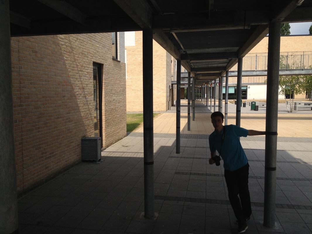
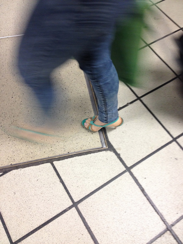
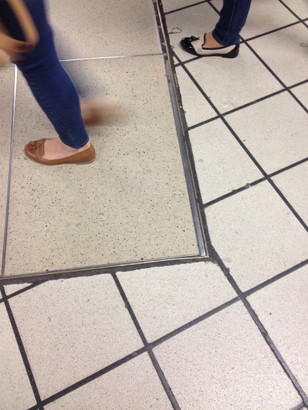
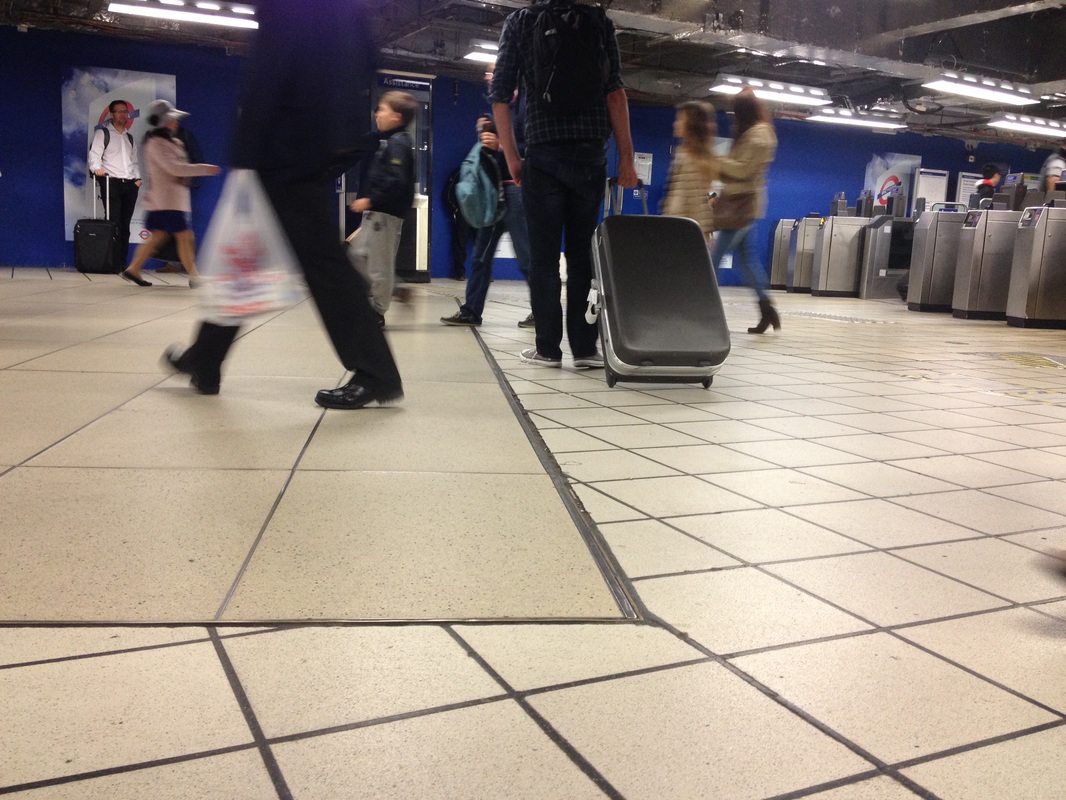
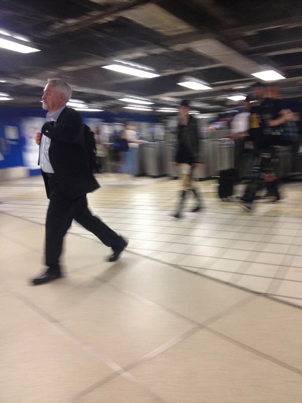
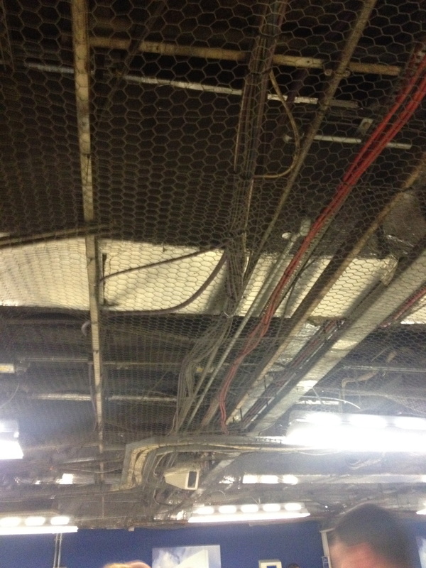
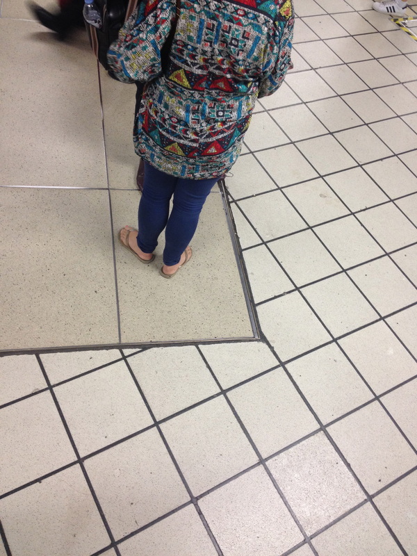
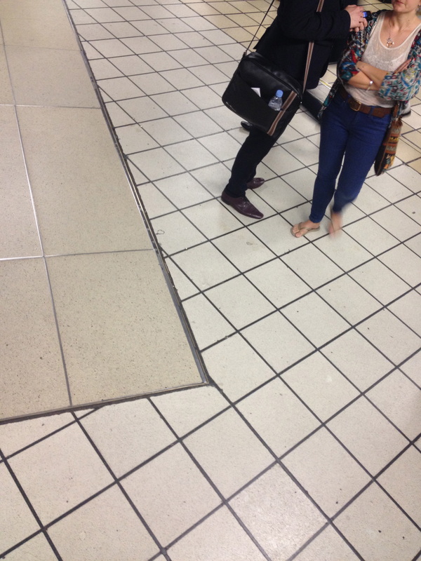
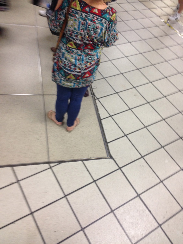
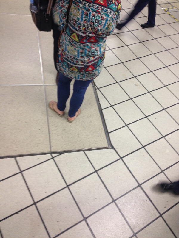
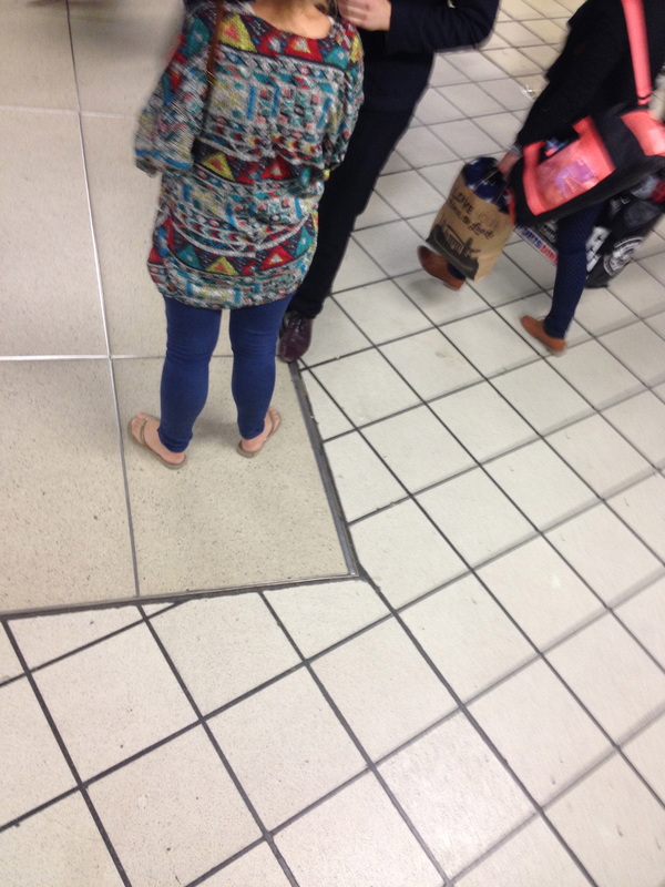
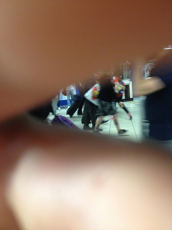
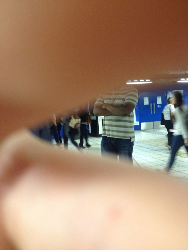
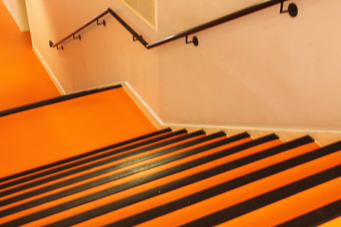
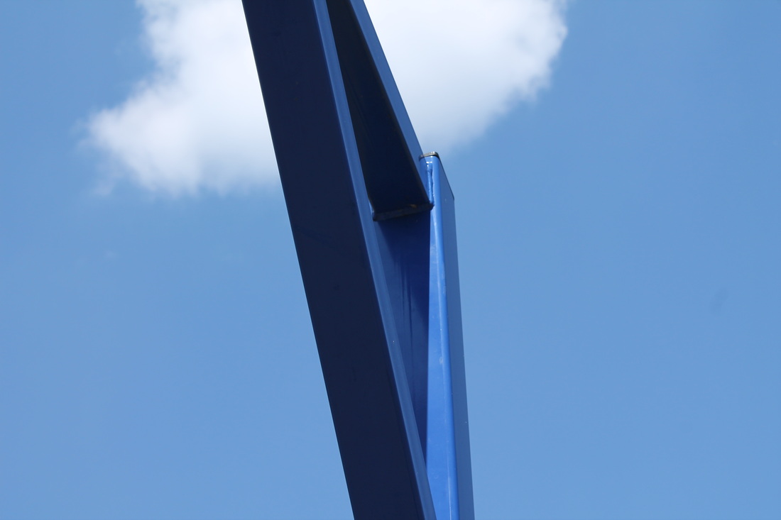
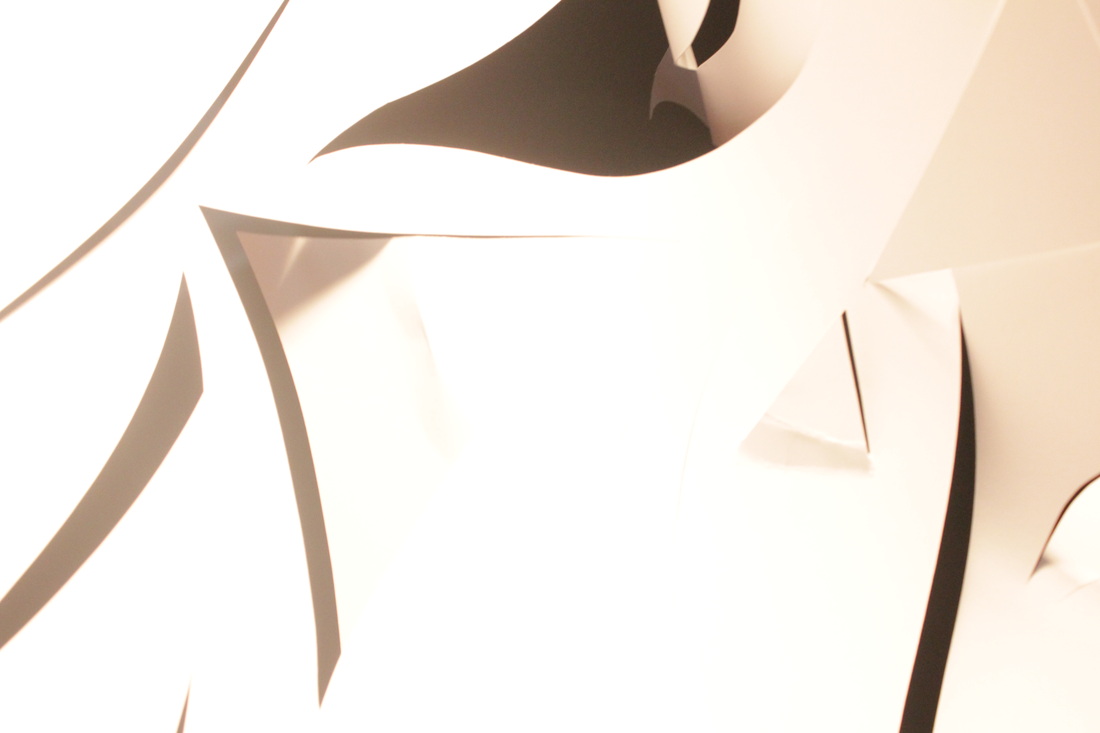
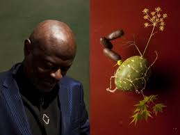
Photographs taken in school, Shoot 1:
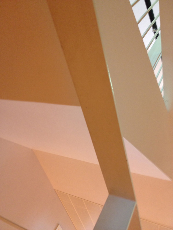
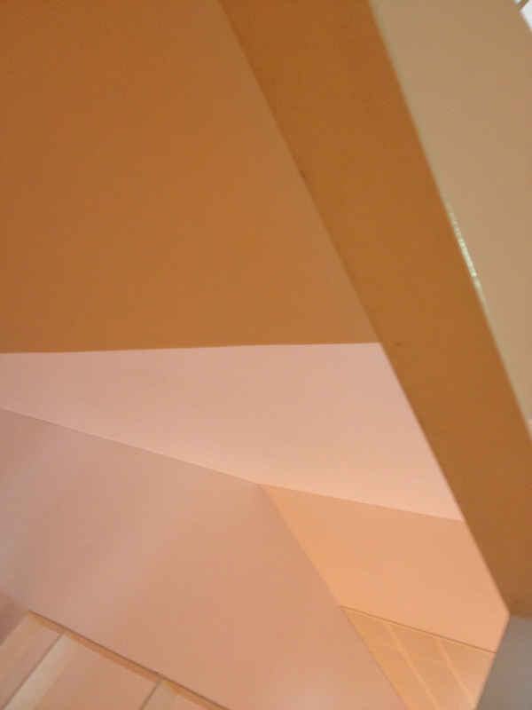
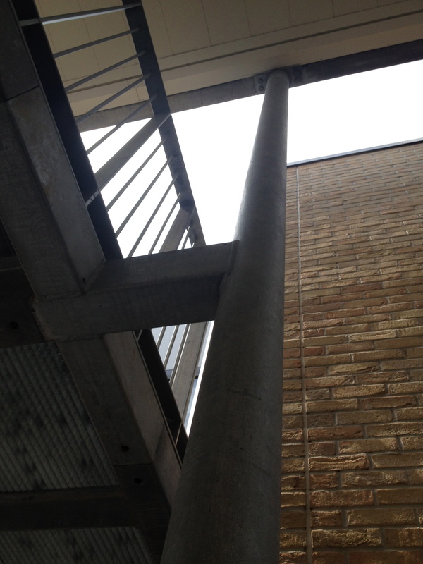
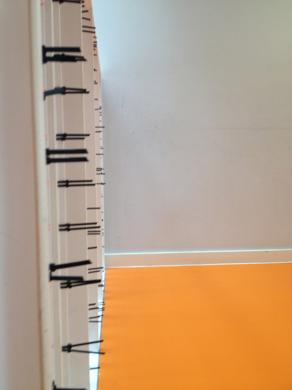
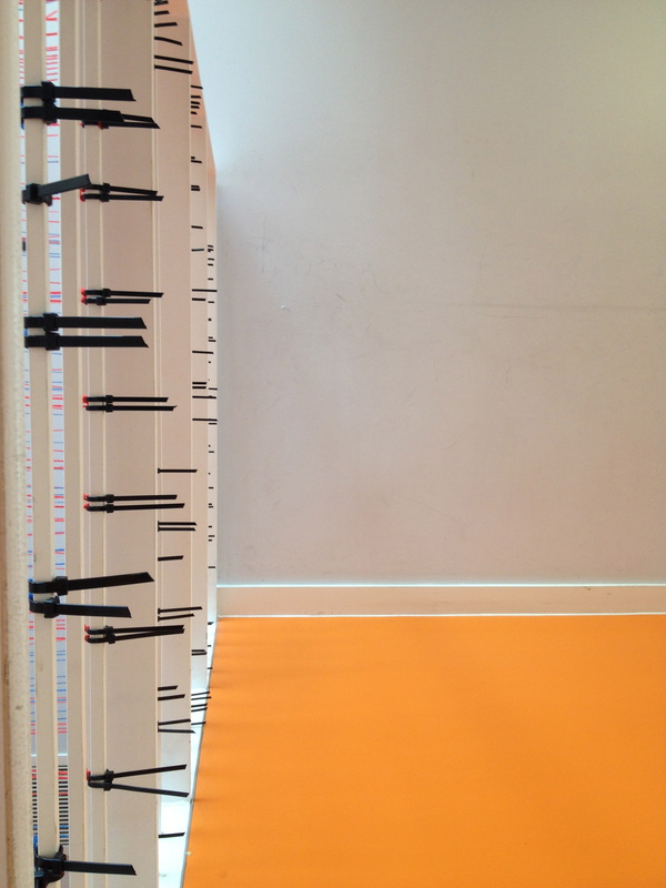
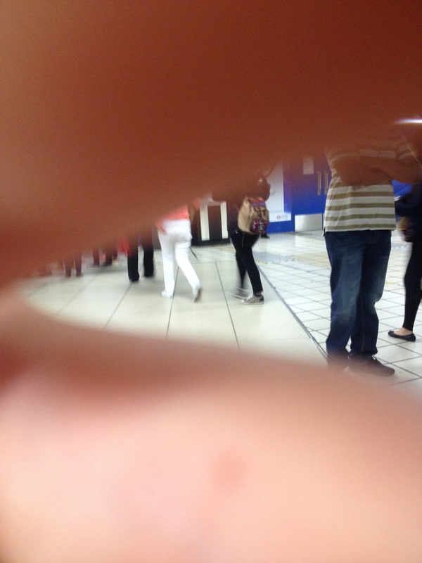
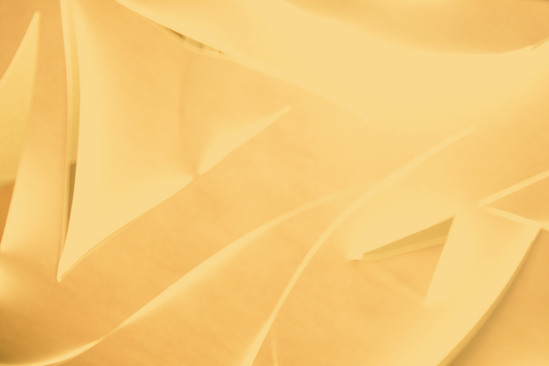
Whilst taking these photographs, I became very fond of edges in triangles and just triangles in general, so I tried to incorporate this outside of school on an italian trip to Islington. I attempted to maintain the theme, edges, include triangles and also make the images interesting and give them a subject or a main focus. Here is the outcome:
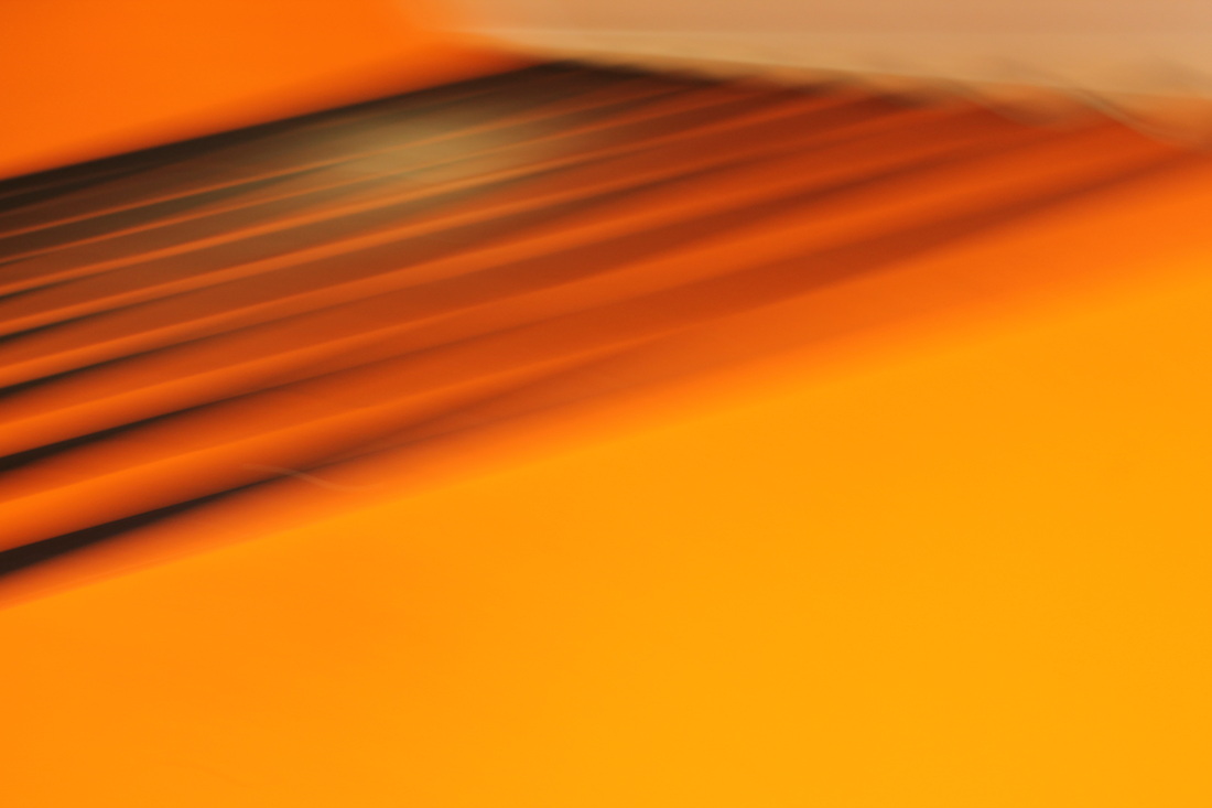
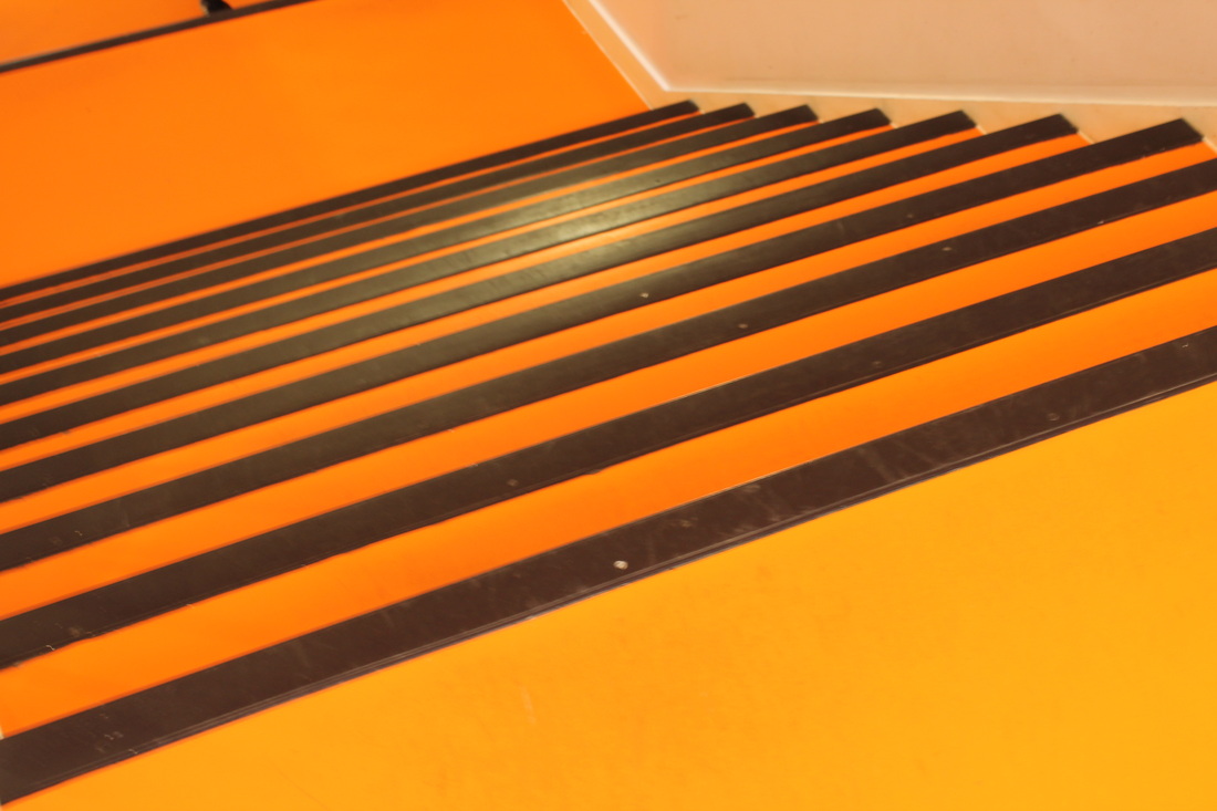
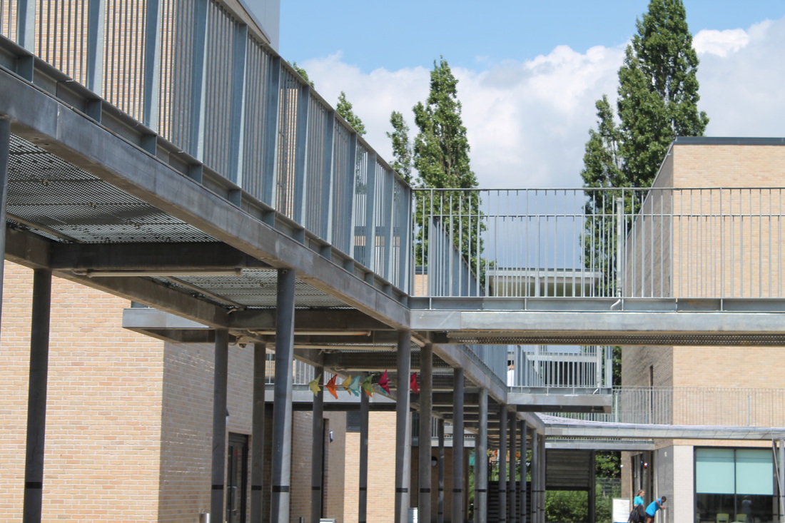
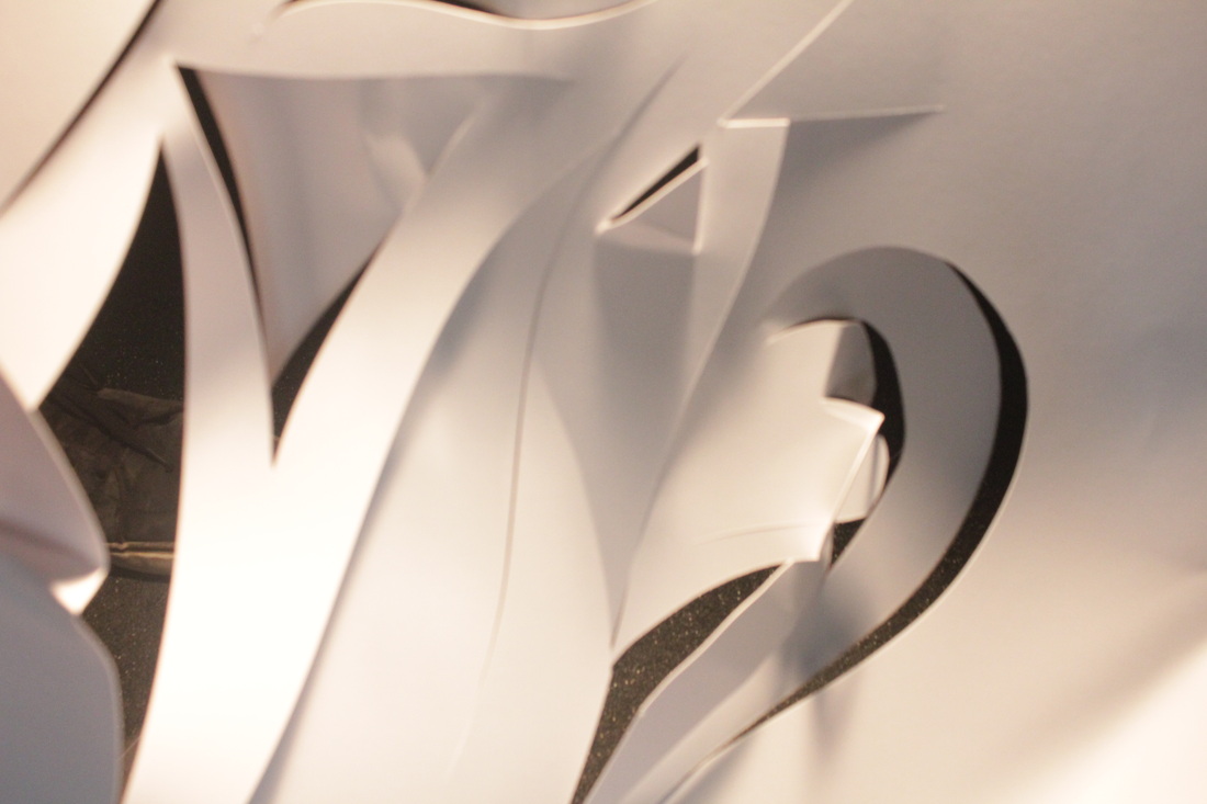
Shoot 2:
Shoot 2:
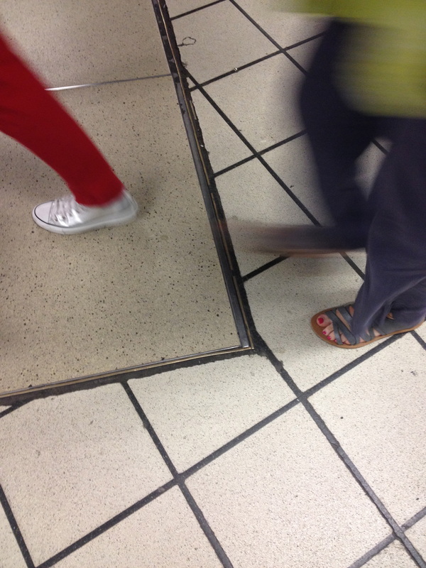
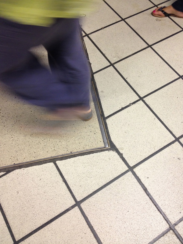
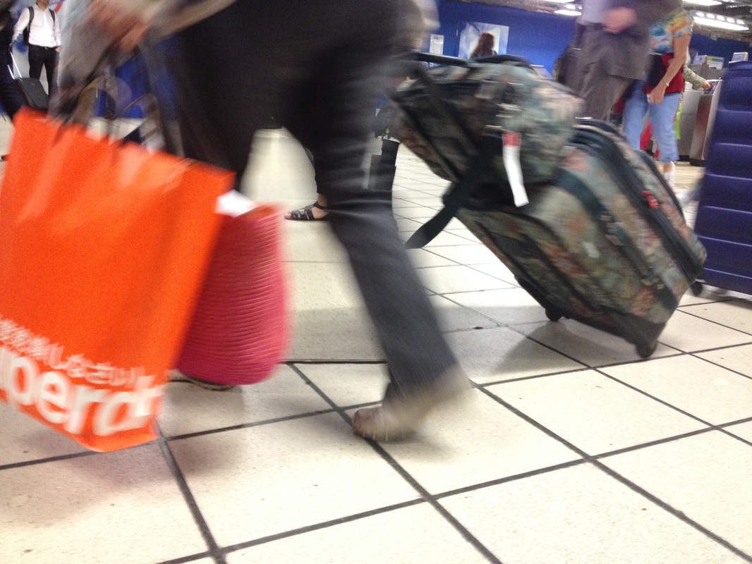
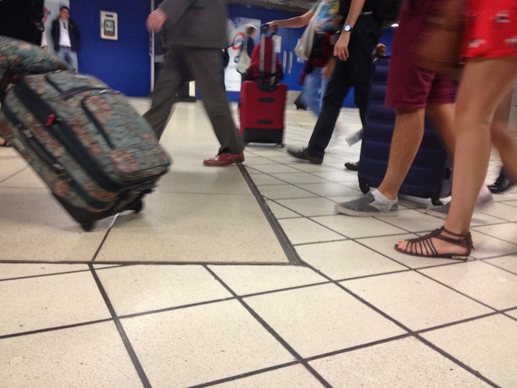
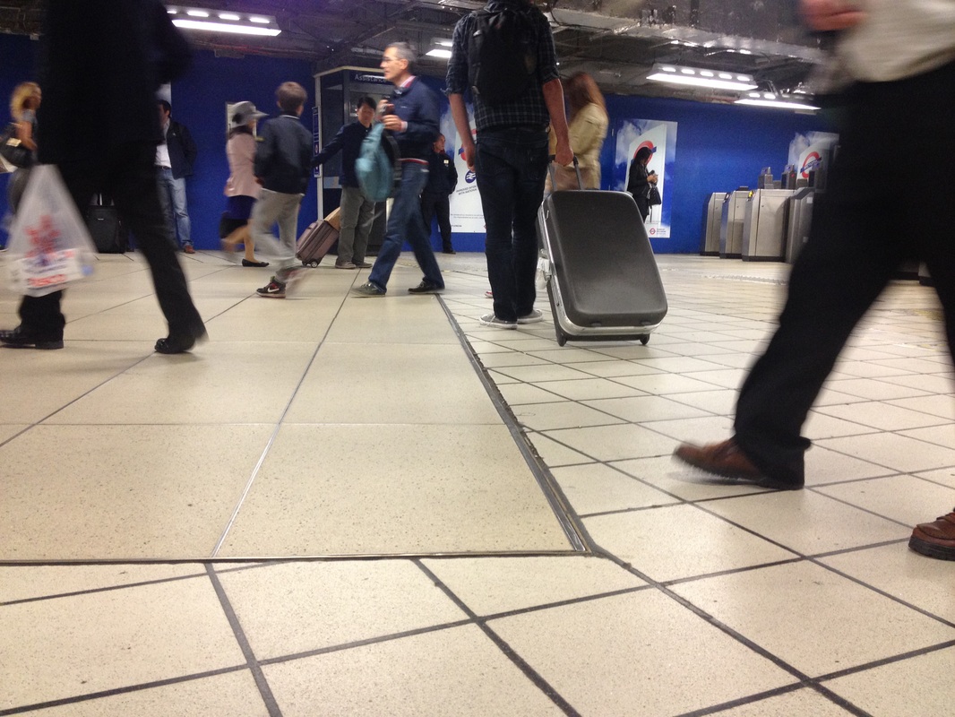
Although interesting, I chose to continue experimenting are searching for more exciting ways to portray edges for my final piece.
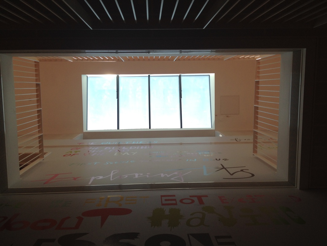
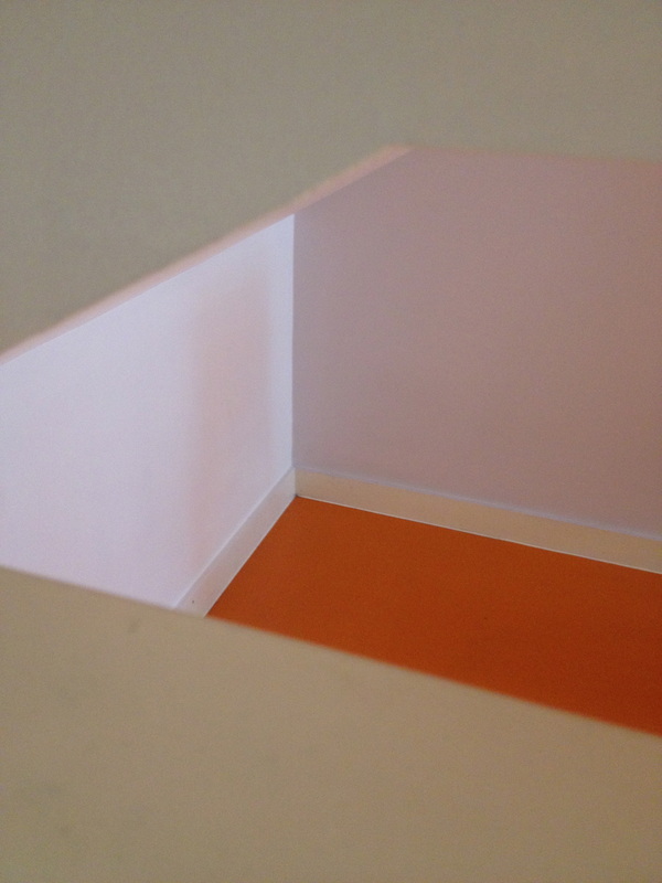
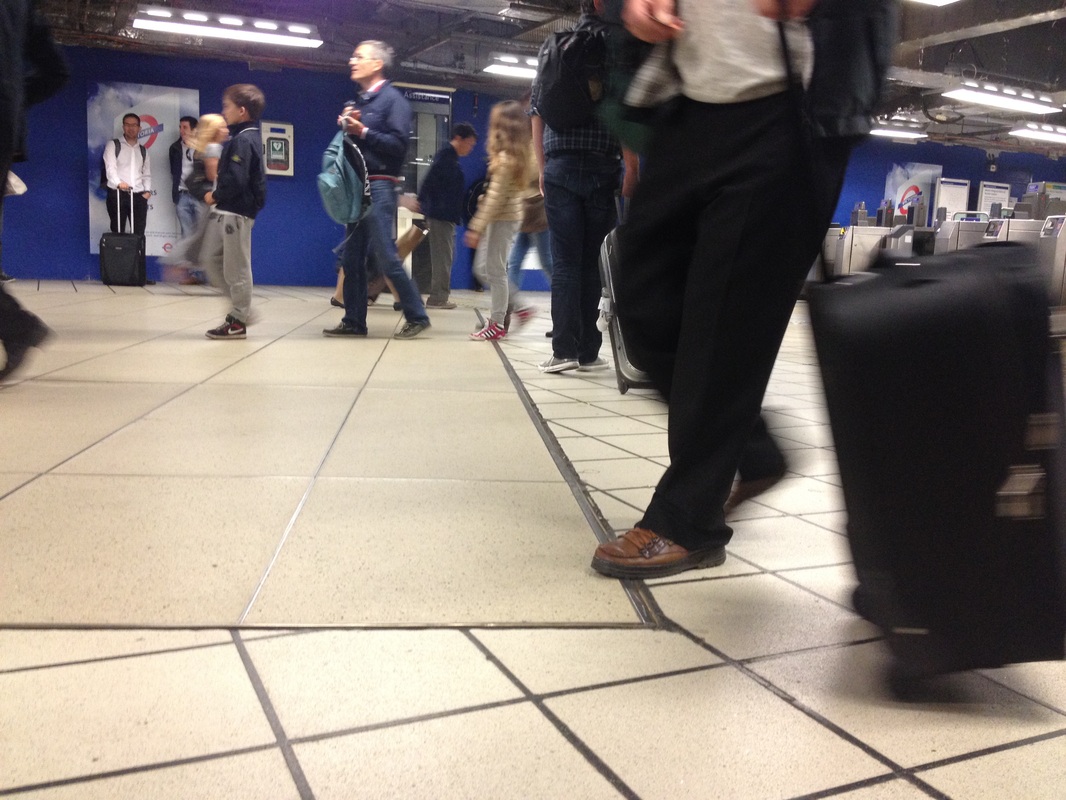
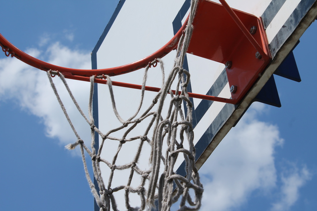
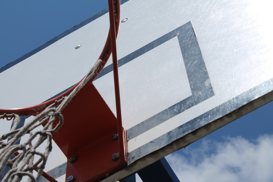
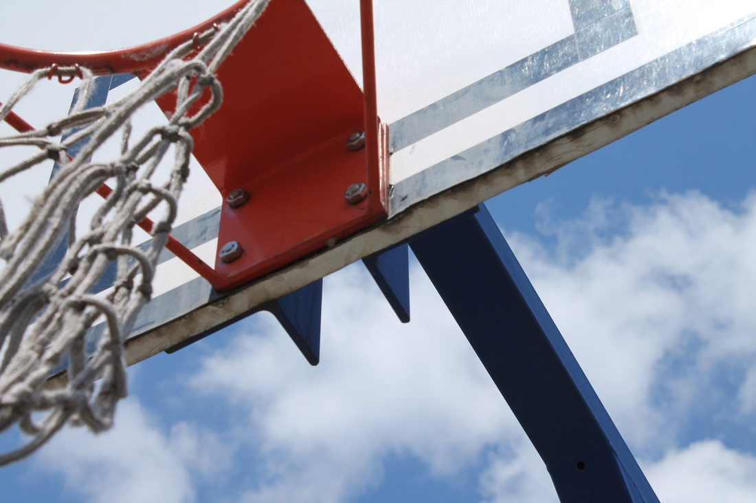
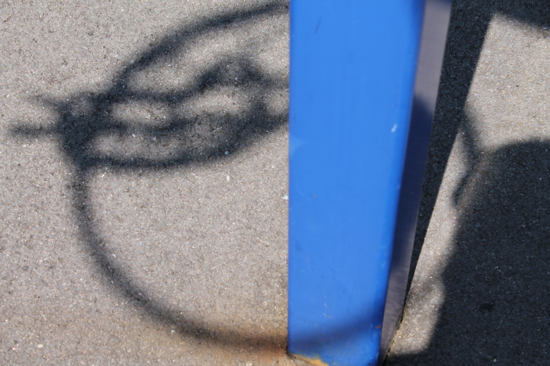
Second set of Images in School, Shoot 3:
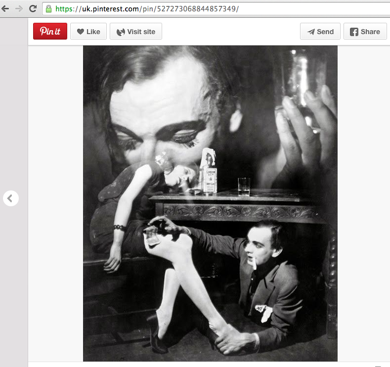
Whilst looking through pinterest of images that involve edges in an attempt to get some reference and influence I came across an image by Francis Bruguiere....
Although irrelevant, i took a look at some of his work and came across some beautiful paper abstractions of his, scroll down and continue to read to see them and to find out more...
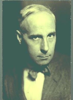
Francis Bruguiere"Francis Bruguière was born in San Francisco to a wealthy banking family and was privately educated. In 1905 he travelled to New York where he met and became friends with Frank Eugene and Alfred Stieglitz. Eugene encouraged Bruguière to investigate the aesthetic possibilities of photography, and Stieglitz accepted him as a member of the Photo-Secession, though Bruguière remained on the fringes of the movement. Returning to San Francisco in 1906, Bruguière devoted himself professionally to photography, opening a portrait studio. In 1919 he moved to New York and established a studio. He began photographing for Vanity Fair, Vogue, and Harper's Bazaar. His interest in the theater led Bruguière to the Theater Guild, where he became the official photographer. In his personal work he continued experiments with multiple exposure images, eventually producing a body of work intended for a film, The Way, in collaboration with the dancer Sebastian Droste. The film was never completed because of Droste's death. In 1928 Bruguière moved to London. Here he started a new series of abstractions and produced the first British abstract film, Light Rhythm.
|
|
He also continued working in commercial photography incorporating contemporary design into his illustrations. Bruguière abandoned photography in 1937 to concentrate on painting and sculpture until his death in 1945. The collection of photographs, negatives and ephemera span the years 1923-1937. Cut paper abstactions and other abstract images make up the majority of the holdings. Multiple exposures, solarization experiments (predominately nudes), still lifes, theatrical portraits and stage settings are also represented. Bruguière's cliche vere prints, portraits of Bruguière, and reproductions of his paintings are also held in the collection." - various and refined extracts from wikipedia.
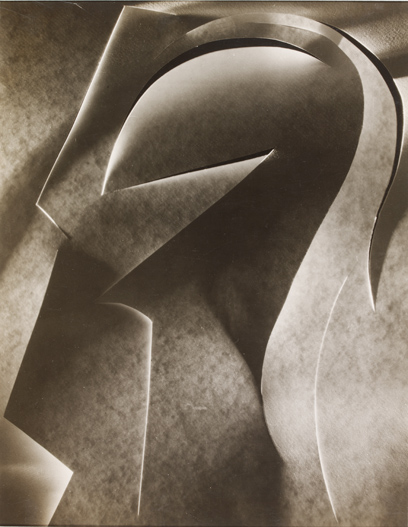
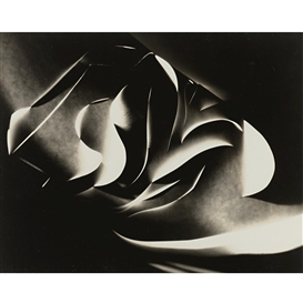
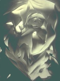
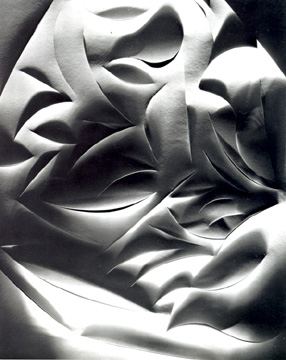
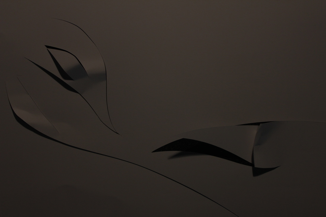
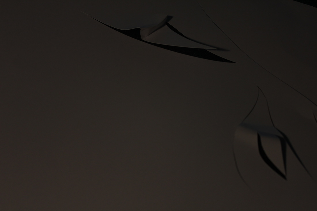
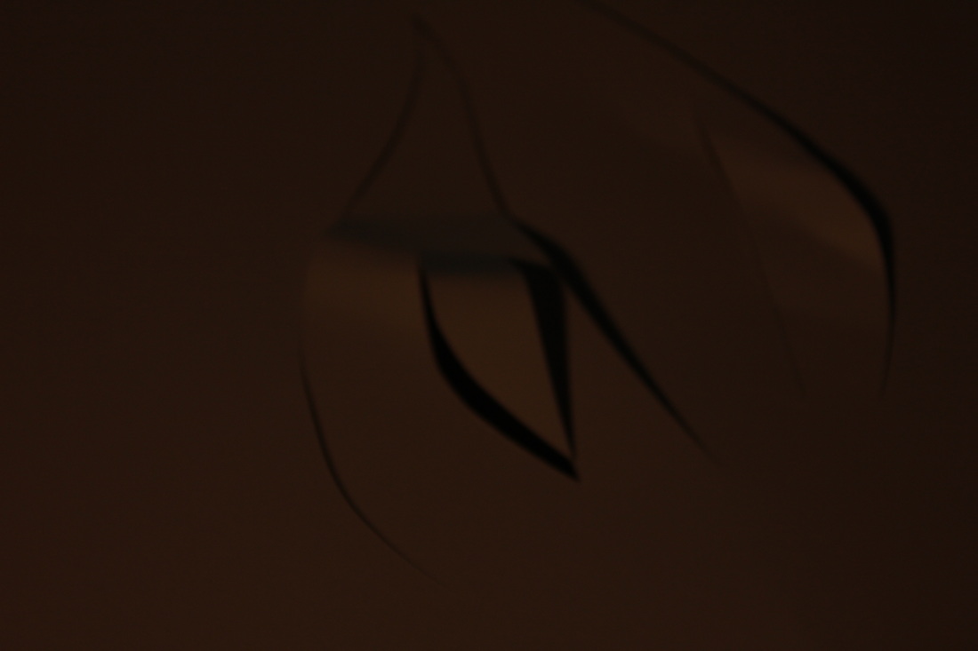
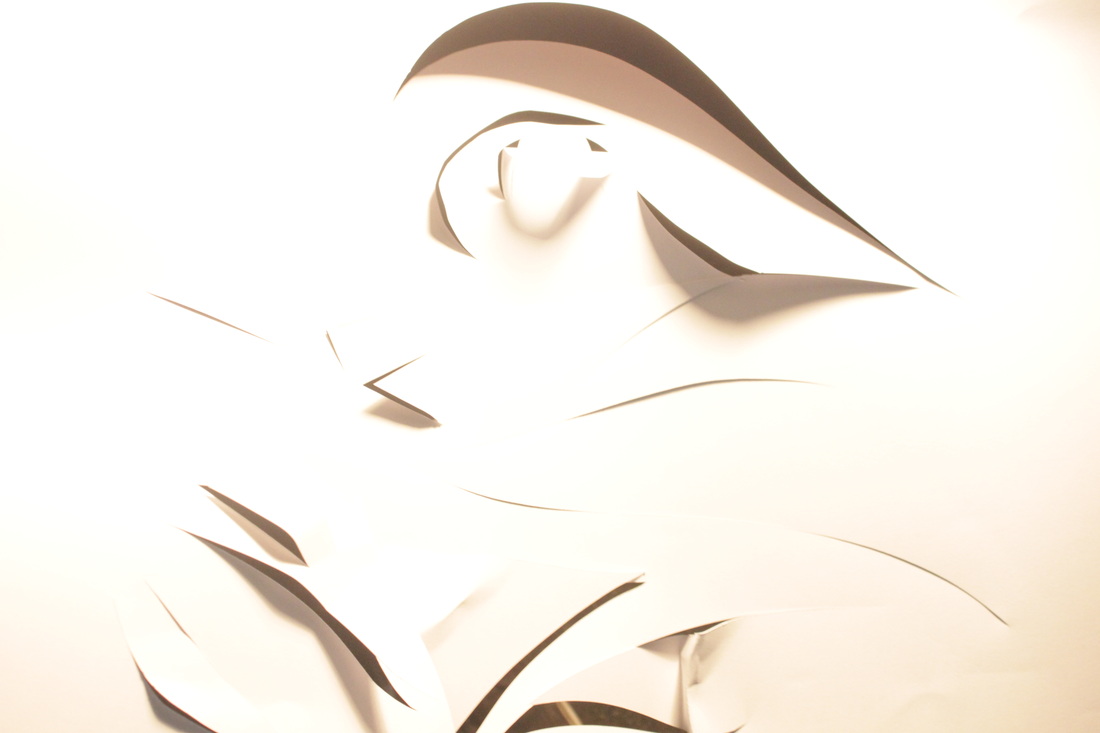
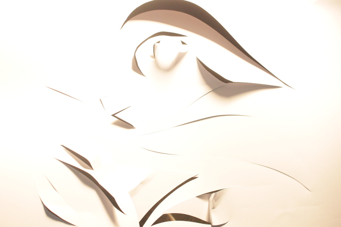
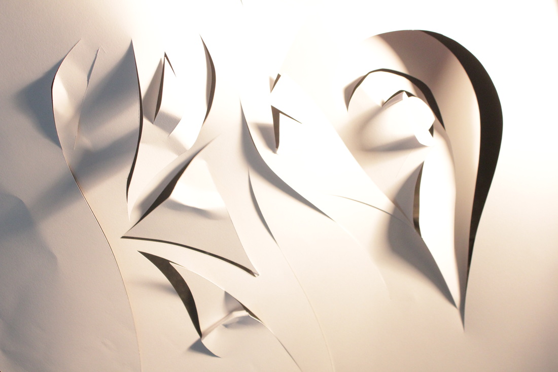
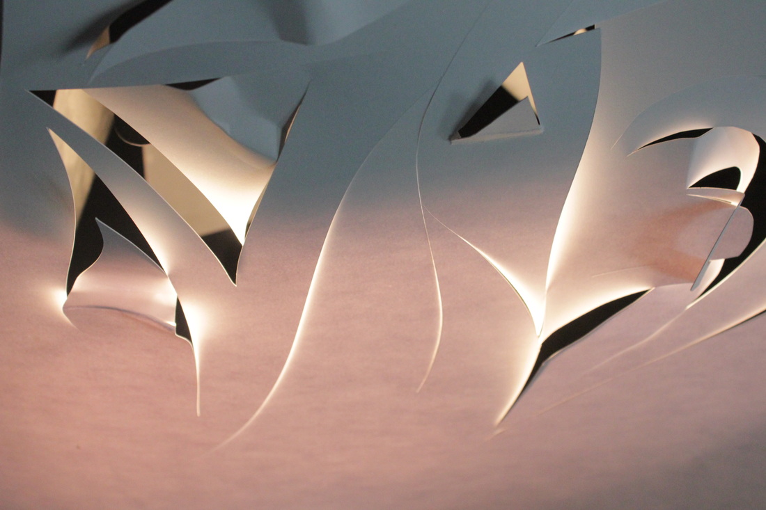
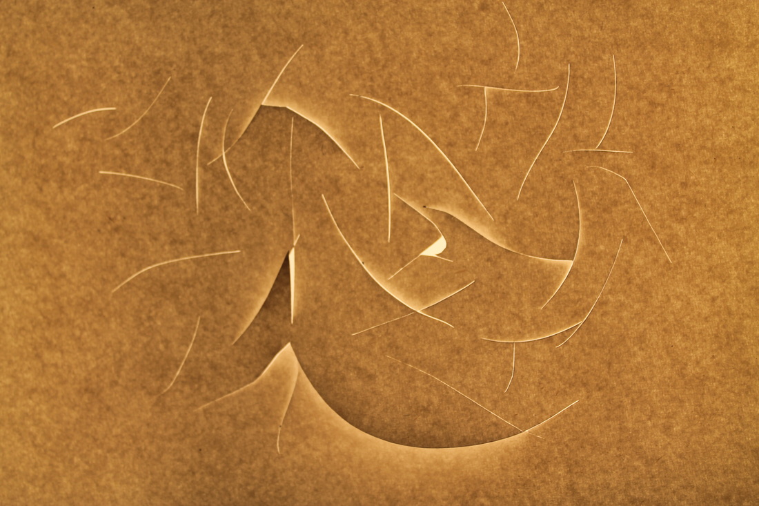
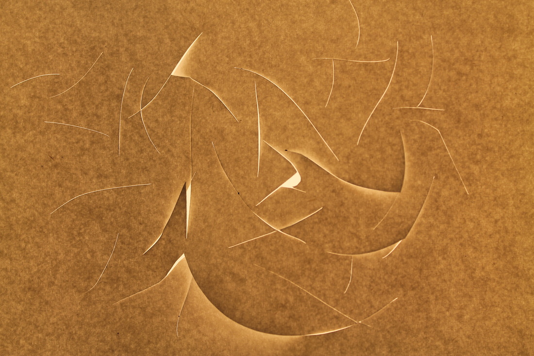
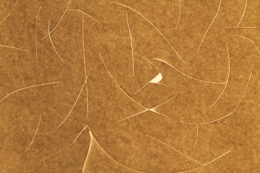
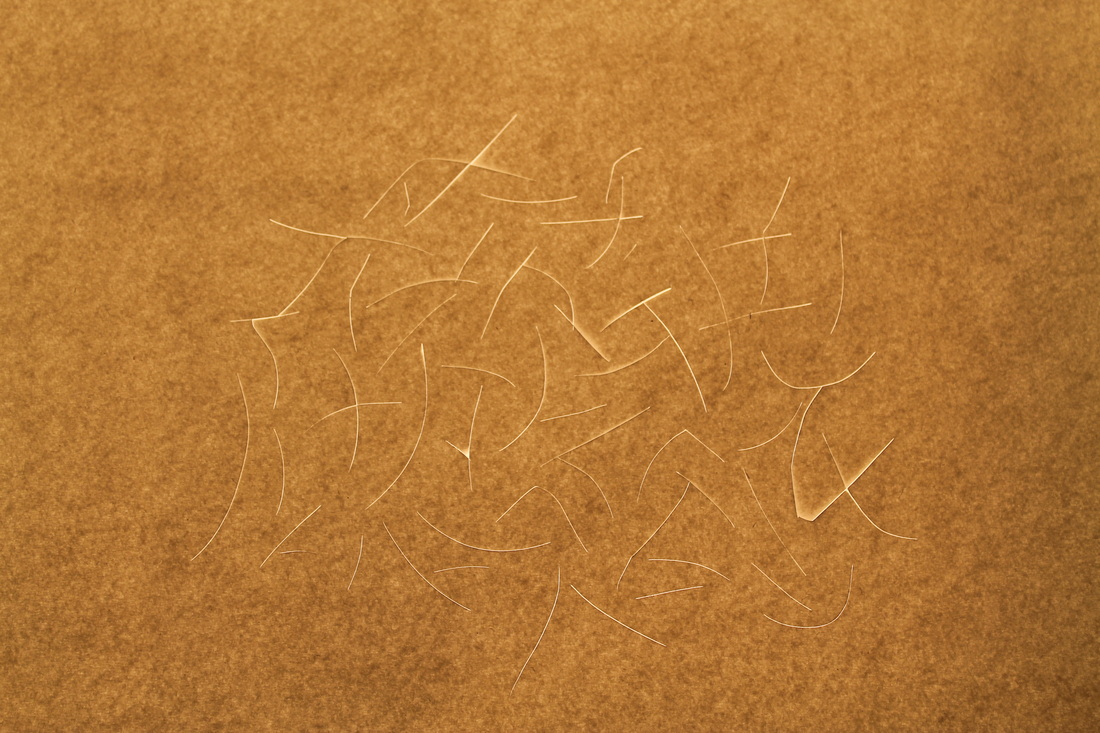
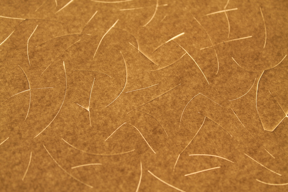
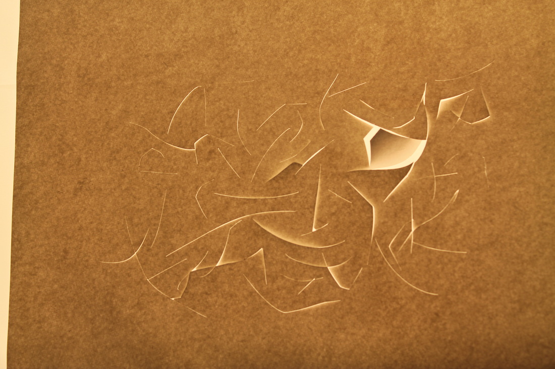
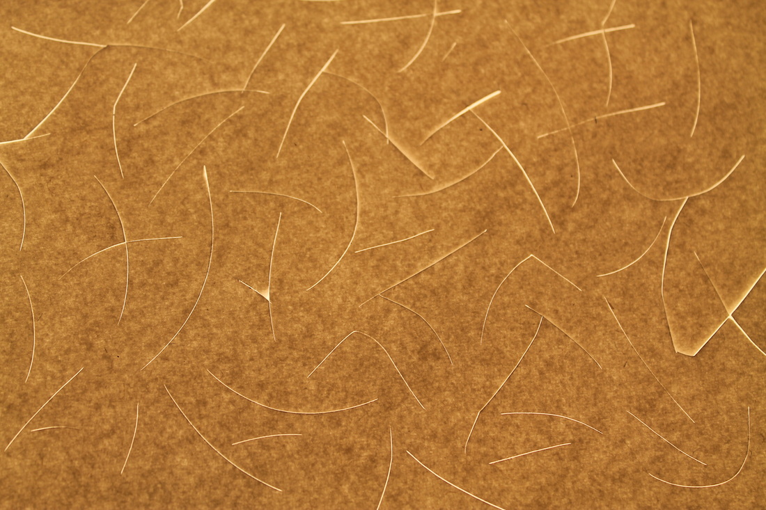
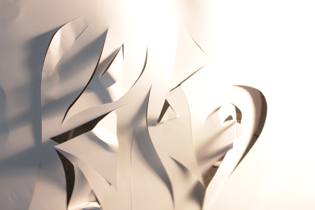
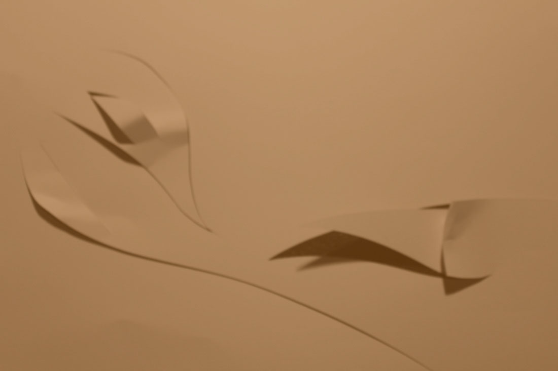
My Attempts of recreating the paper abstractions.


Self Evaluation
After comparing my photographs to the ones of Brusuiere, I noticed that the photographs are different in specifically two technical ways.
The first being the brightness of the photographs, some being over and others under exposed. This is due to the fact I had the DSLR on manual so I had change it myself. In my next set of photographs i will try to perfect the brightness to get it just right so that cuts are sharp but the white is not as overpowering as it is on this set of pictures. I would also like to try to photograph my paper with a different coloured filter on the lighting equipment as I think it would give the photographs a more "trippy" unique look.
Secondly, the softness of the photographs themselves. This is due to, again, two different factors, one being the type of paper I chose to use. This being relatively thick card which in my opinion made the lines and shapes edges more sharp and able to distinguish. where as if I had used a regular sheet of A4 paper, the shapes would've had a thinner border an the light would of passed through it too much. I would like to experiment with the thickness of the paper next time. And the second factor being the type of camera. I think that if I had used a more low fi camera the images would have come out more softly. Such as a pin hole camera- the only problem is that if I were to use a pinhole camera, I wouldn't be able to show the colour if I were to put a filter over the light. Perhaps i could experiment with colour and filters on photoshop.
Lorenzo Vitturi
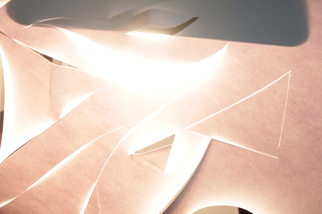
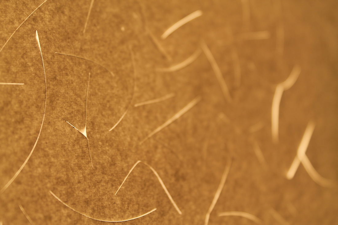
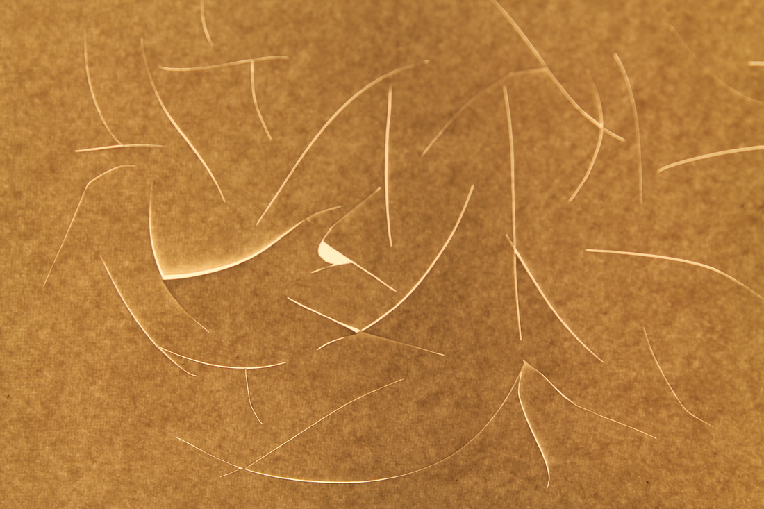
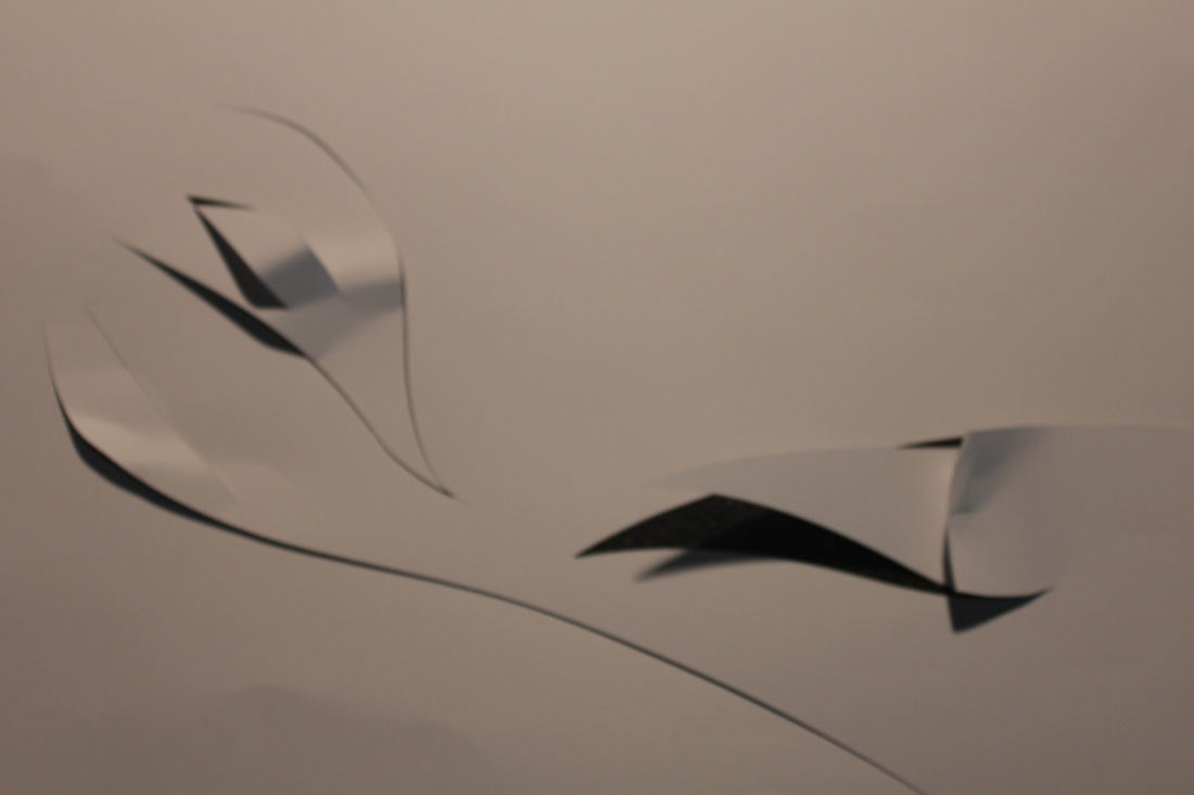
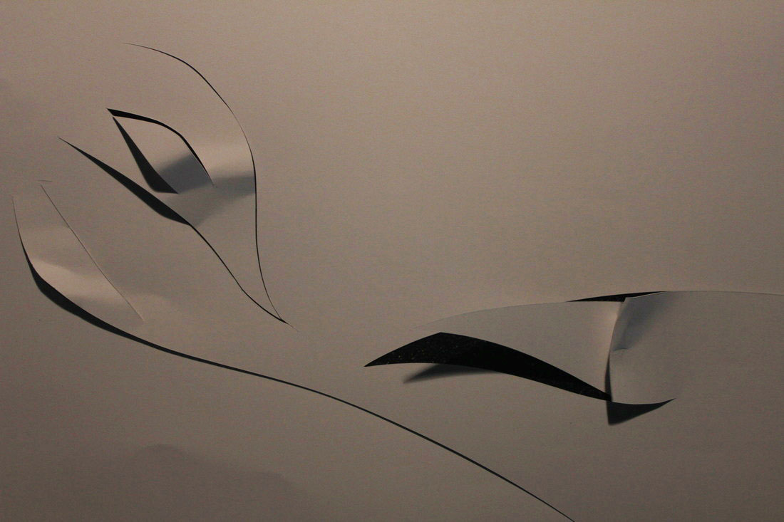
Second set of Photographs: Francis Brugiere.
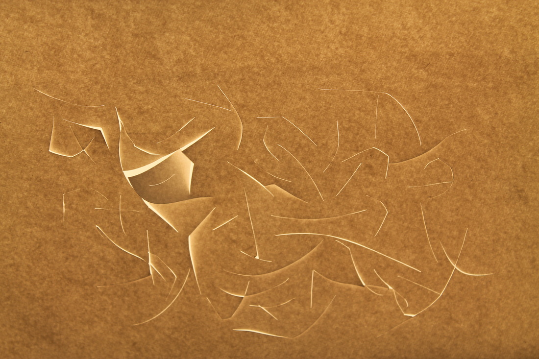
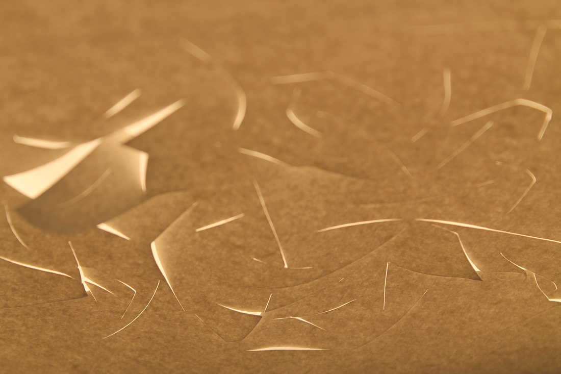
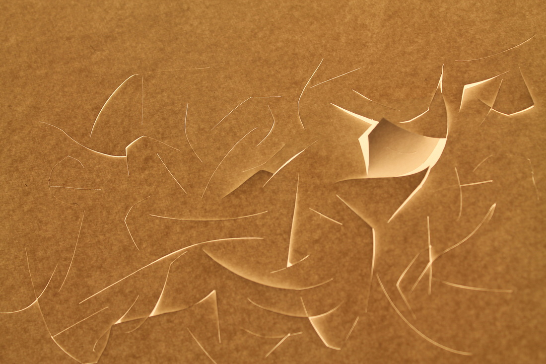
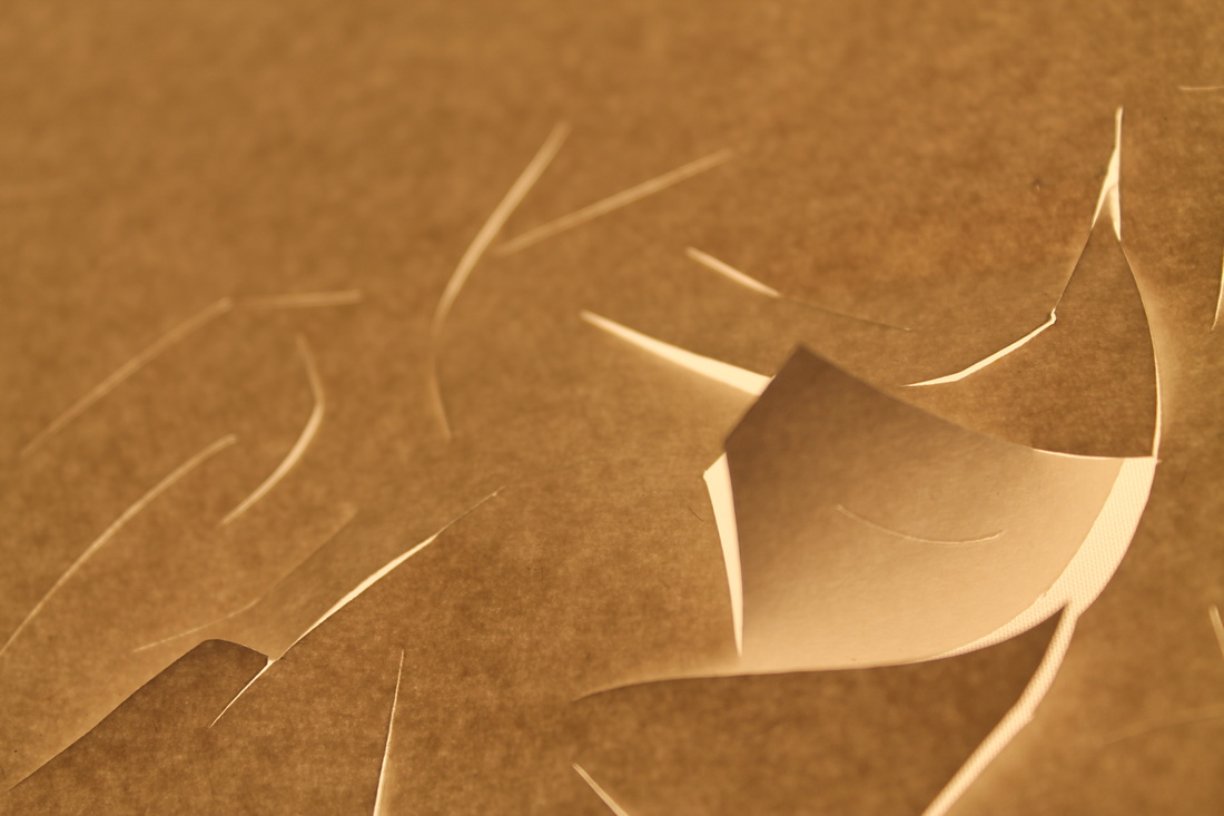
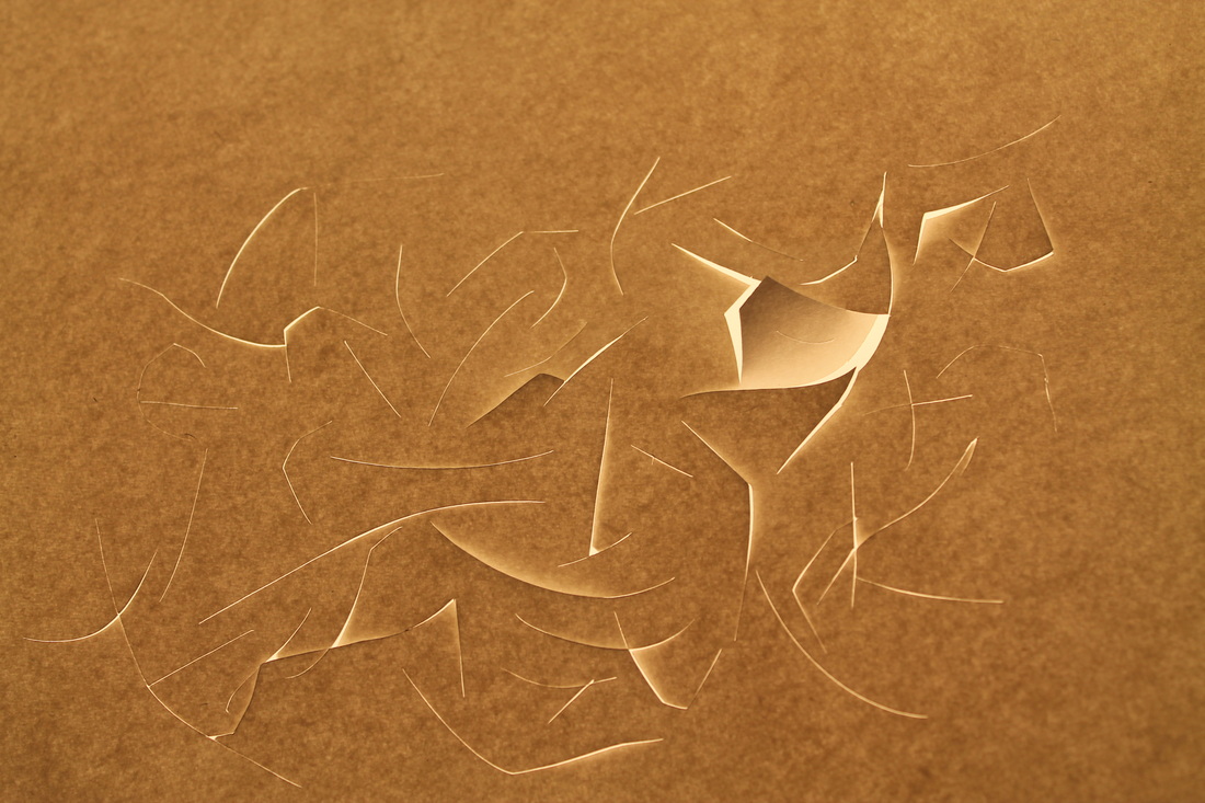
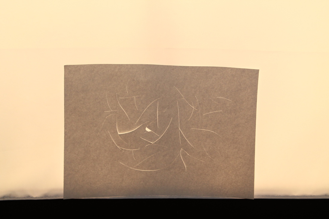
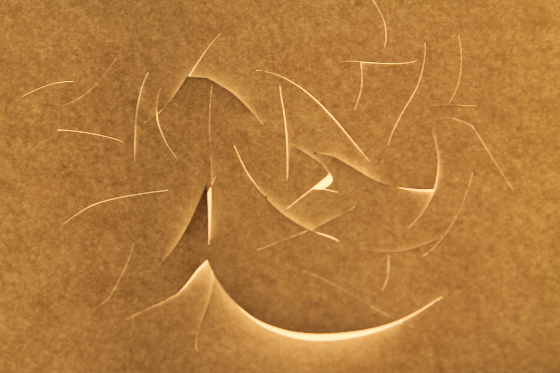
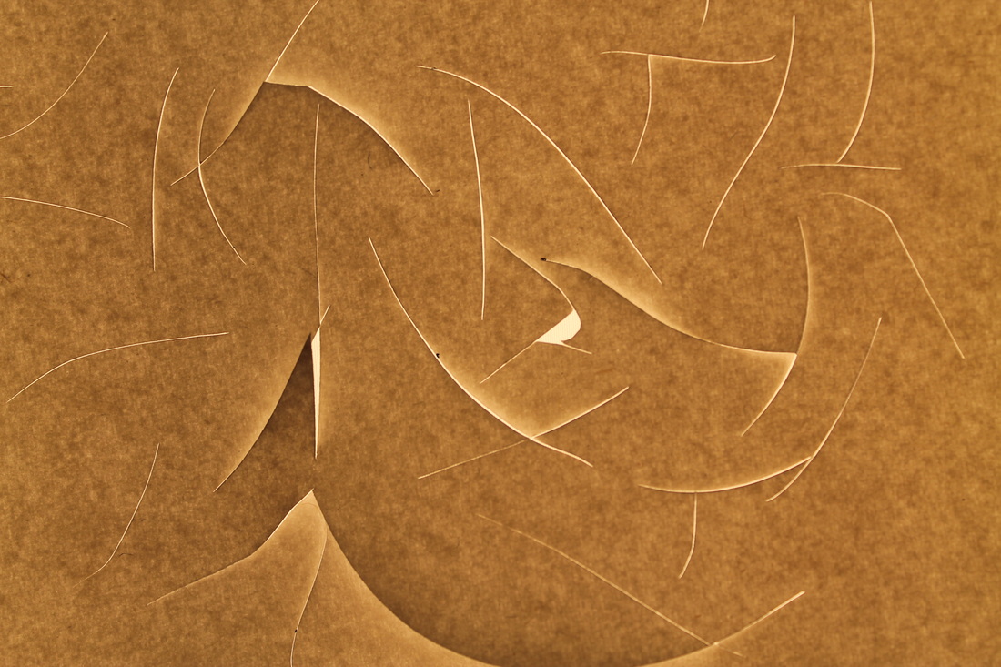

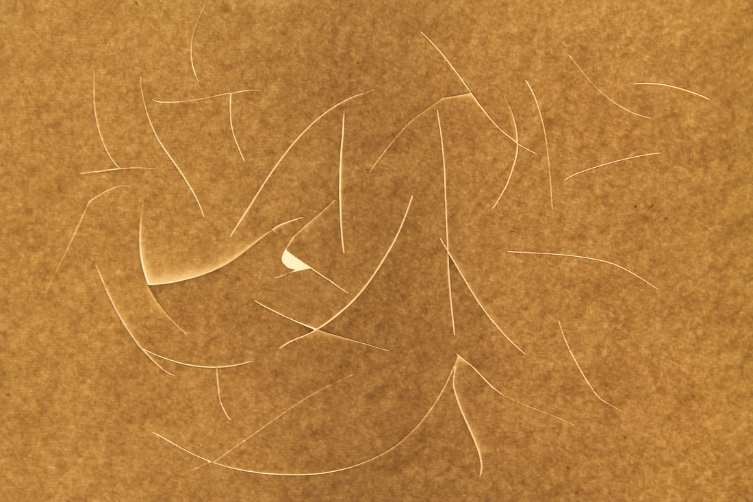
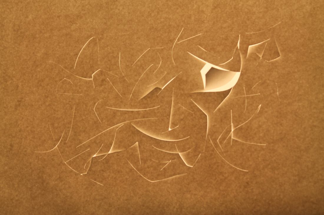
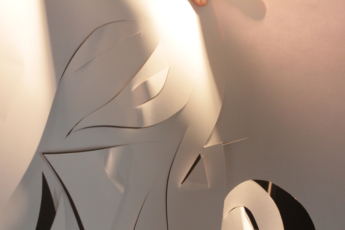
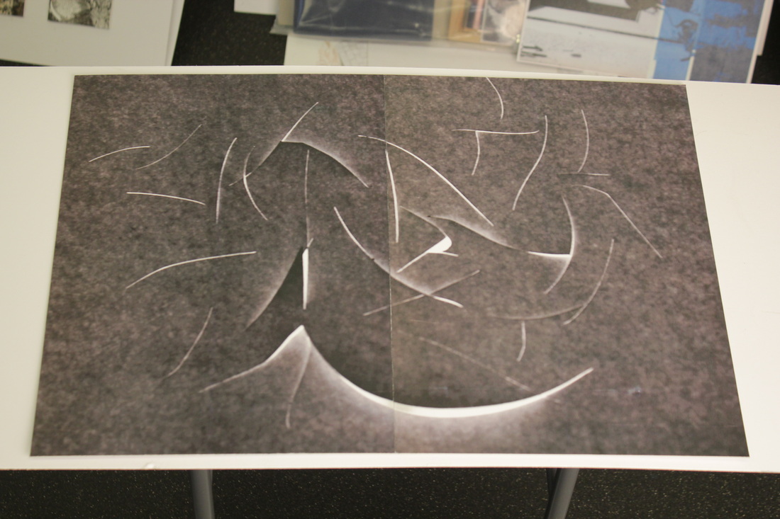
This time, instead of lighting the photographs from the front, I light them from the back so that I could pick up on the way in which the light passes through the paper. Also, I covered the whole of the Light so that it would trap any excess light and stop it getting out from behind the paper and lighting the front of the paper. The effect was just as I'd hoped I could achieve from when I started photographing my own paper abstractions.
Next Steps...
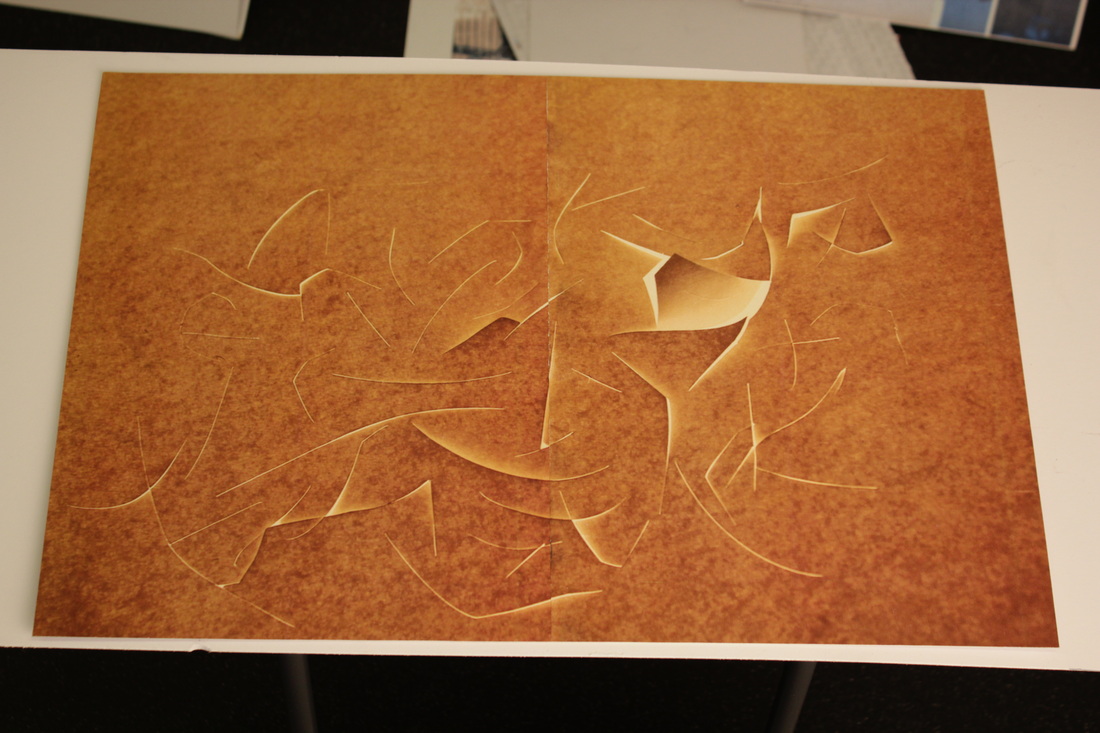
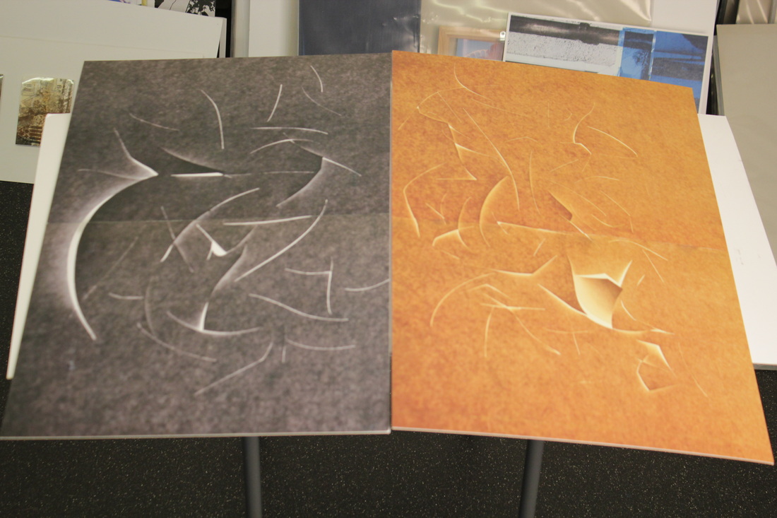
After taking these photographs, I felt like doing something with them. So it took two of the images and printed them out in A3 (in two pieces then mounting them together). One image, in its original colour, and the other in black and white. I then spray mounted them separately on A2 boards. Im thinking of presenting them juxtaposed, showing the contrasting colours.
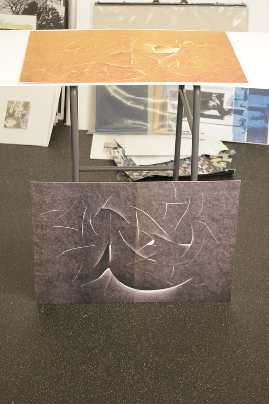
I decided to display these as my final piece for my Exam.
Photoshop Edits of My Earlier Photographs
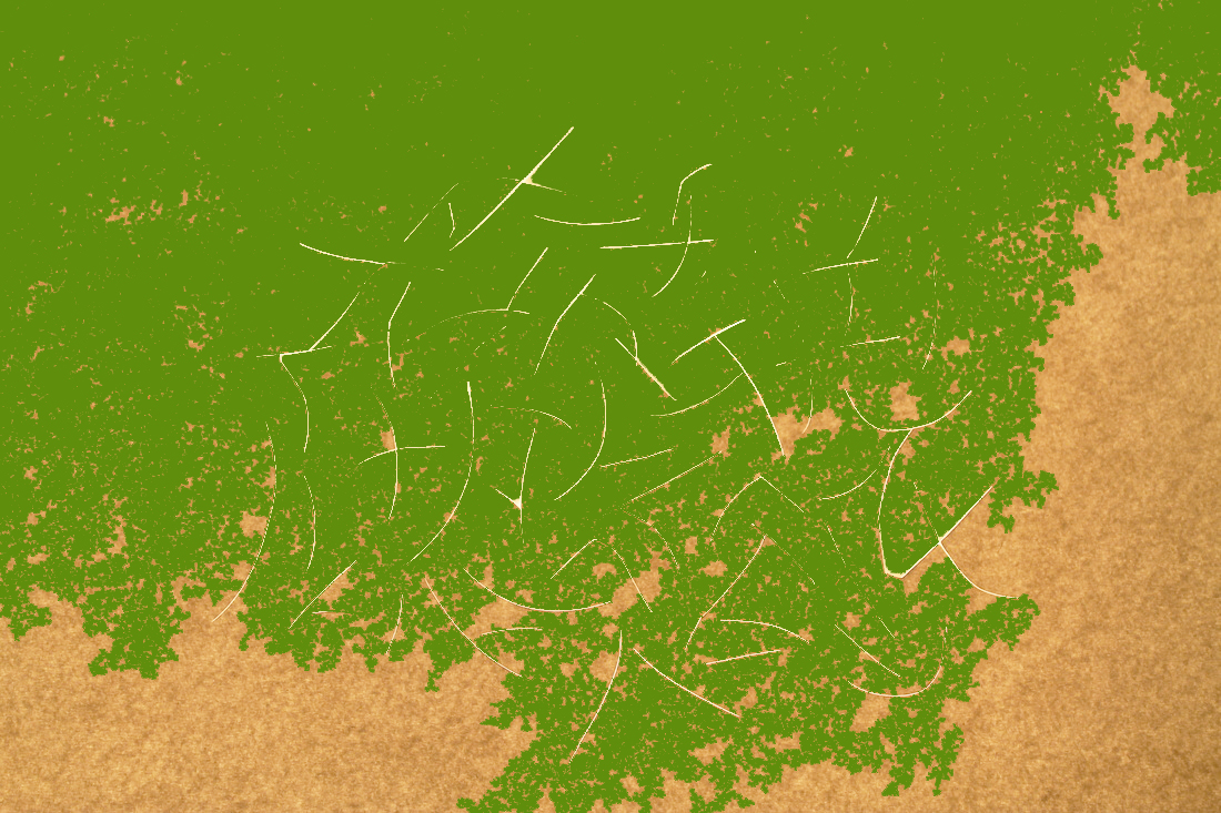
To develop my idea and to experiment with these simple paper abstractions, i opened 12 up in photoshop and consecutively edited them, messing with brightness, saturation ad colour. Although a lot of the images i edited didn't turn out very nicely there were a few that i found attractive, these are below...
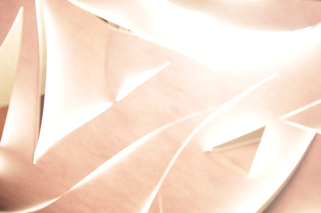


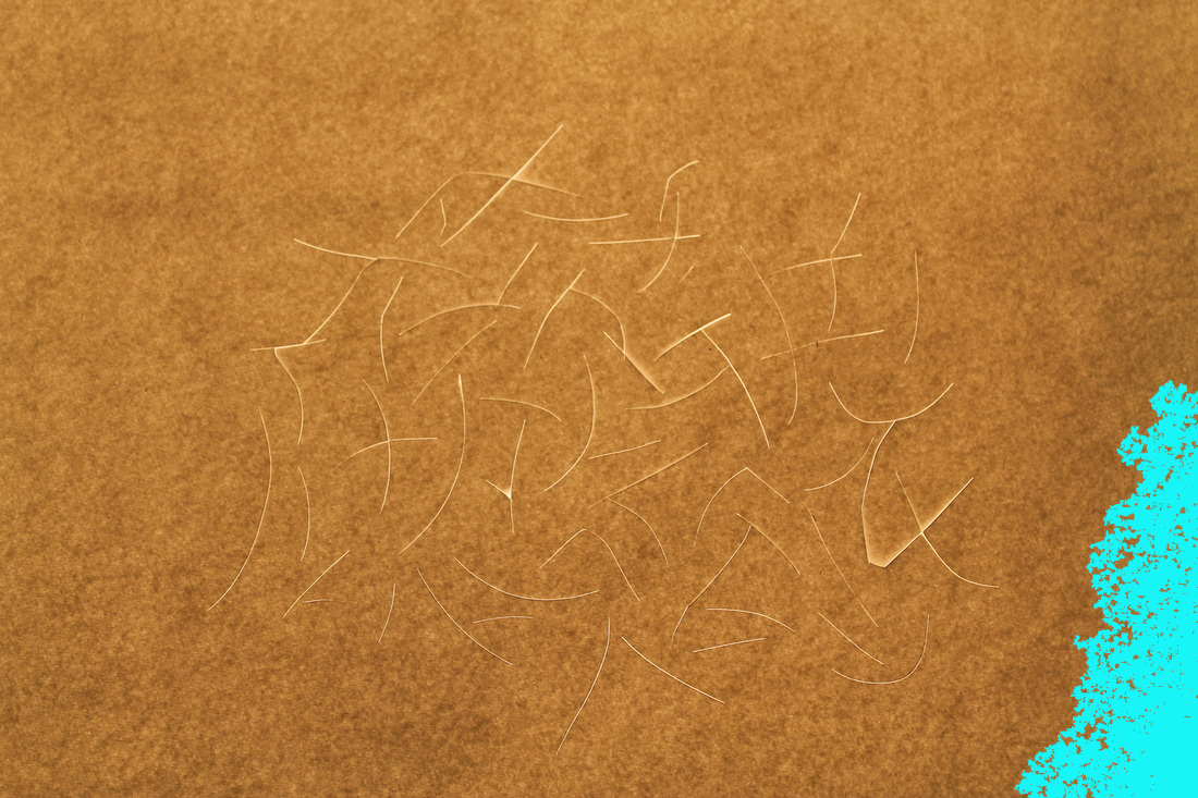


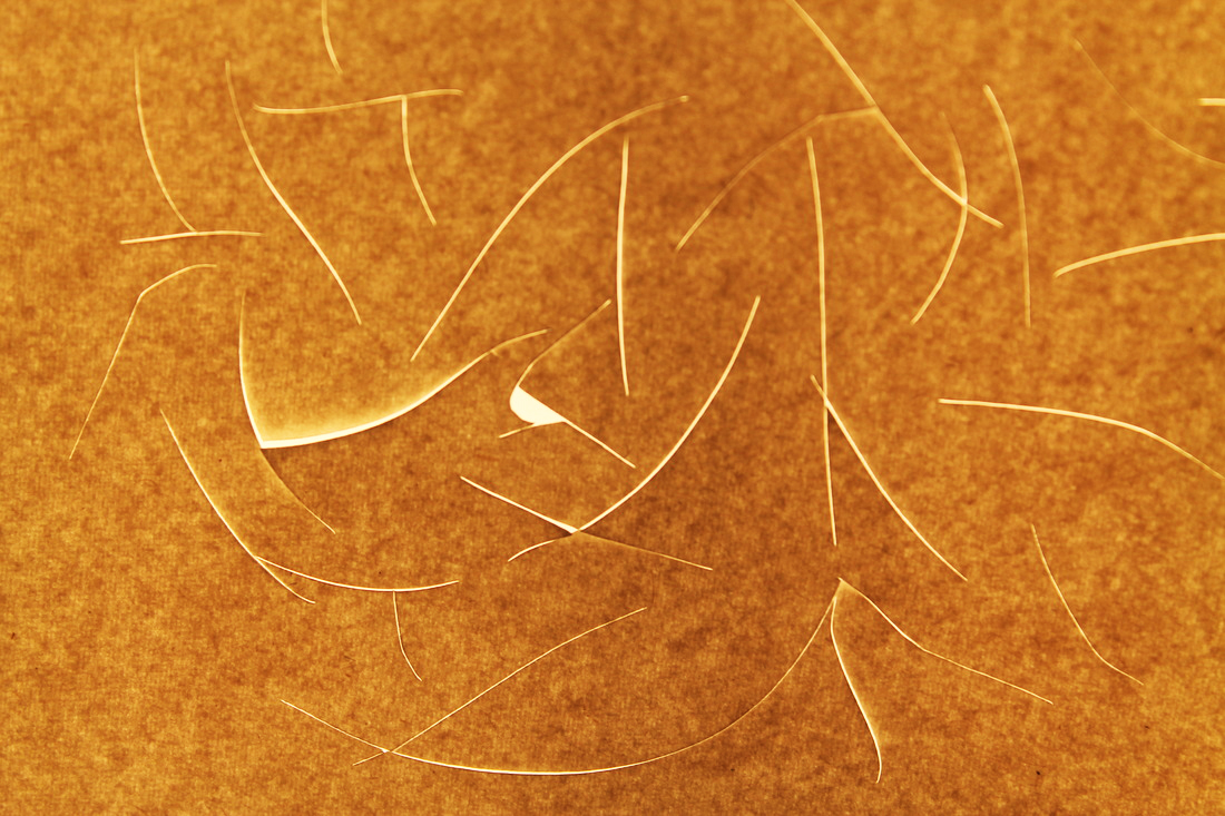


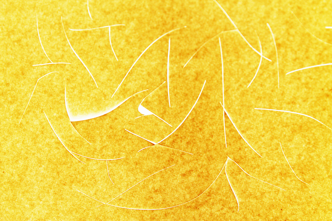


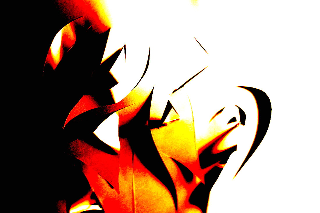


On the photographs above, I only changed three things. These were filters, brightness and contrast. Below are some of my favirouts.
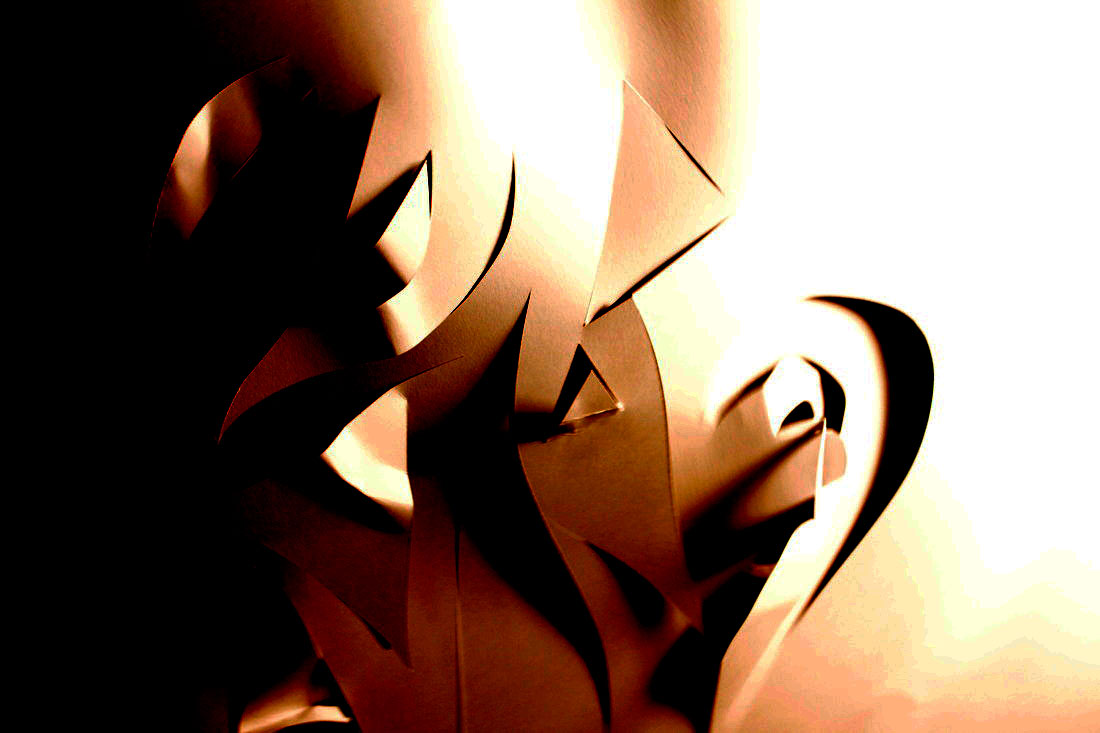
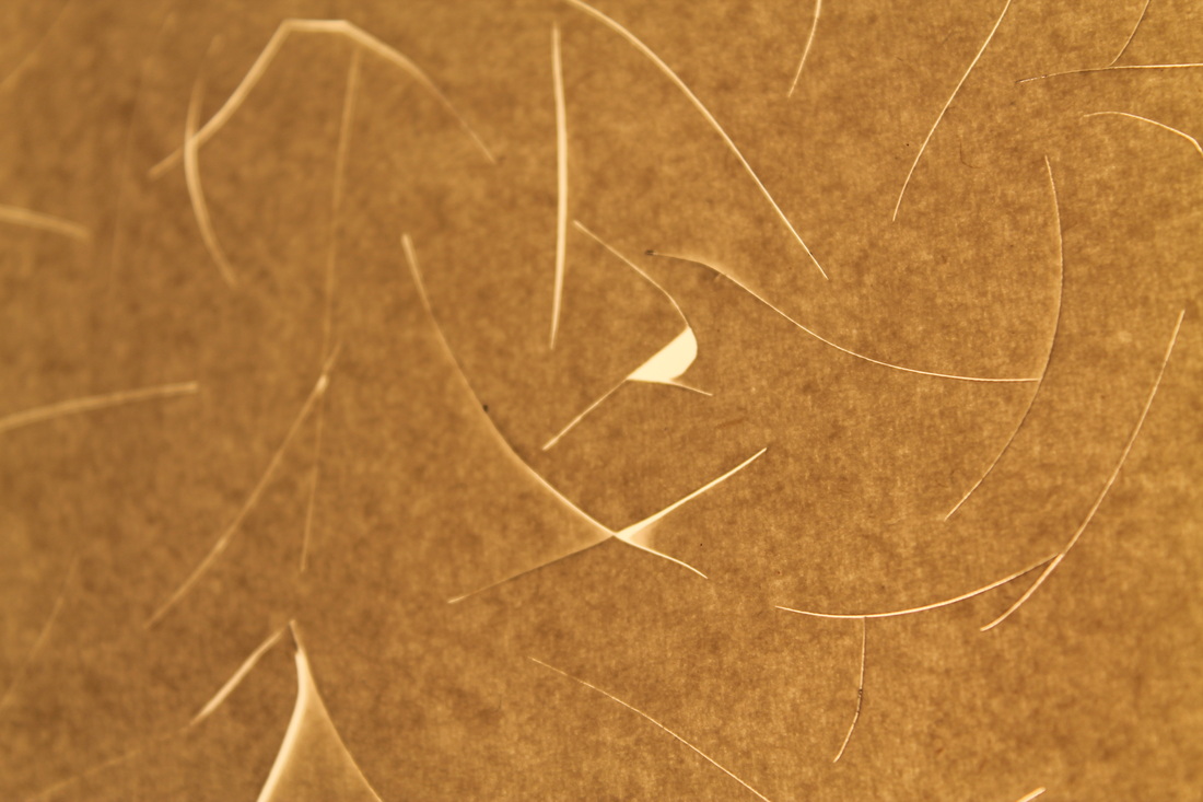
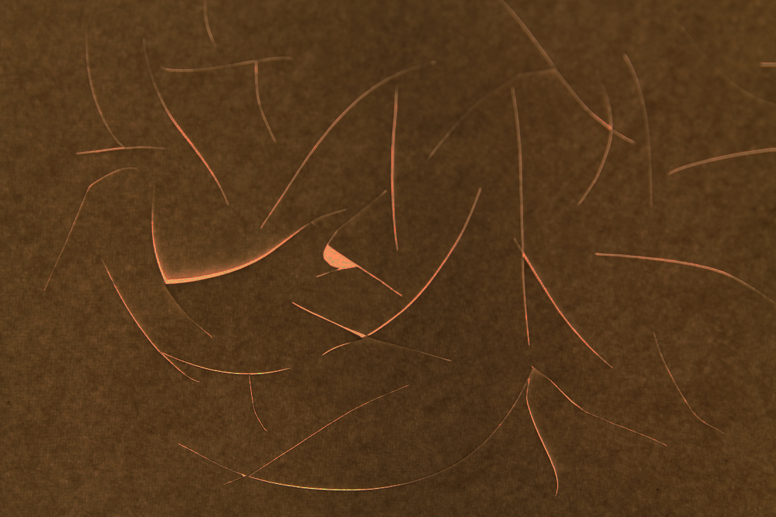
To me, this photograph looks like a badly animated fire, or at least reminds me of one. The shape in particular help this. Th triangles look like the tips of flames whereas the lomg lines cutting through look like the main stems of them. In addition, the colours not only being what they are, but moving from dark to light remind me of the dark of a fire place with the fire raising out of it.
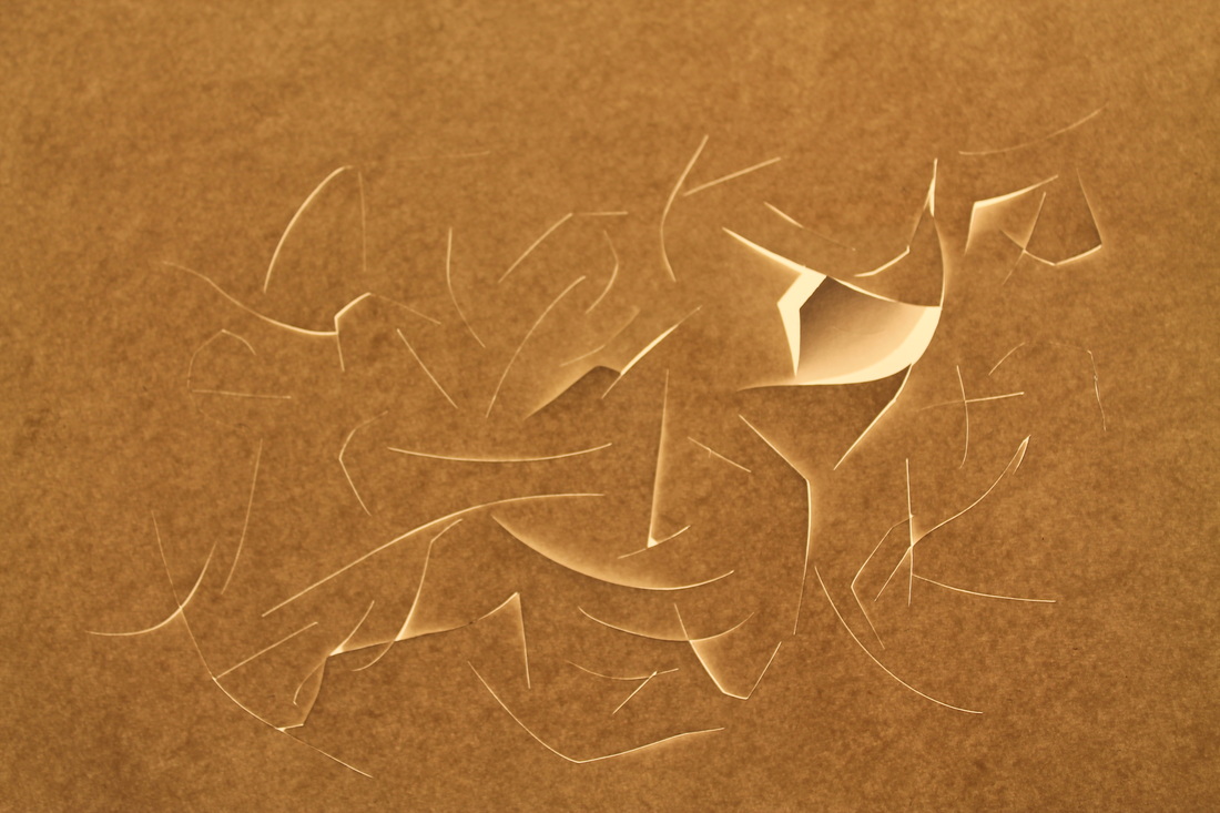
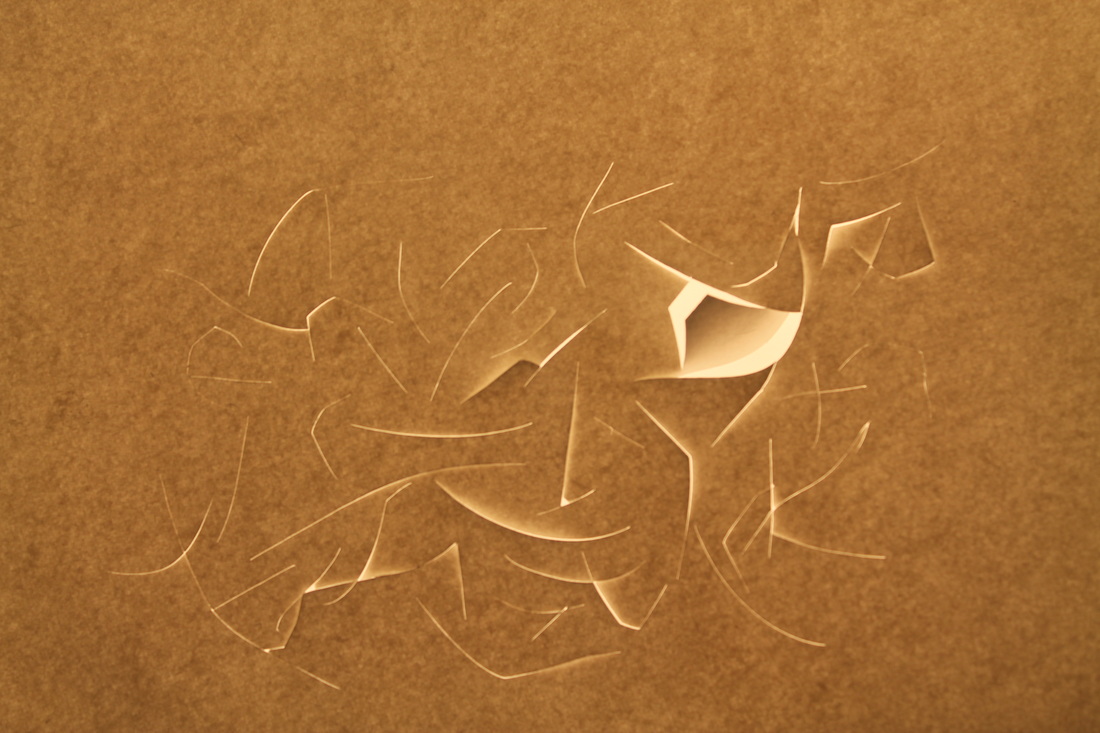
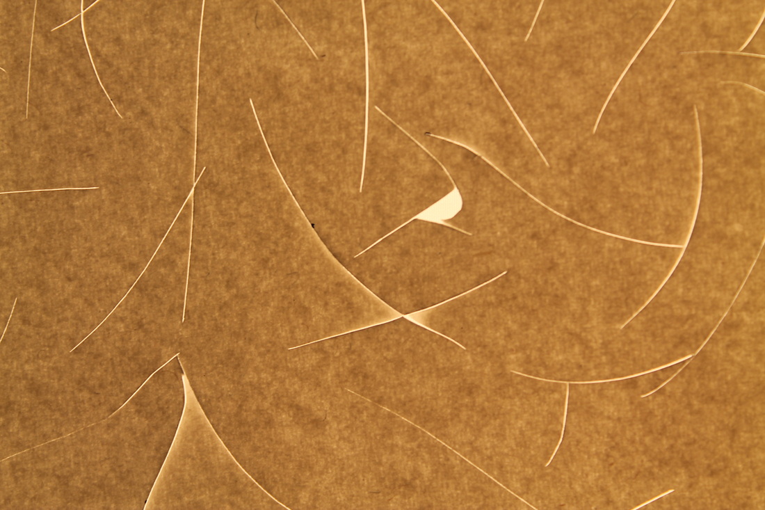
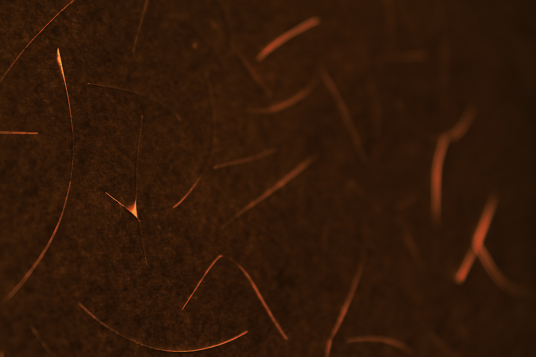
My Alternative Final Piece:

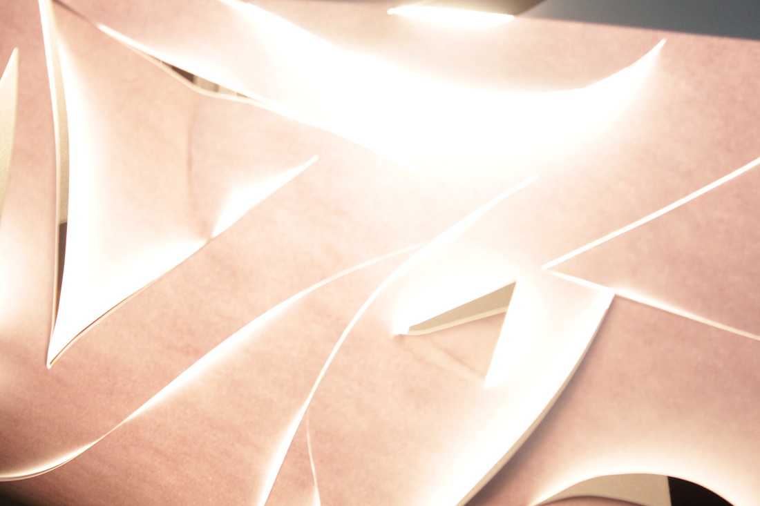
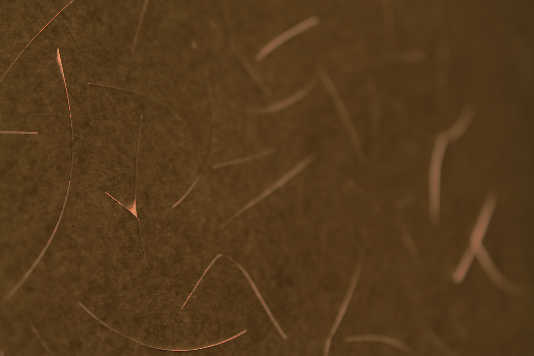
WWW:I mainly like this photograph because of its intimacy and delicate nature. The lines that I cut using a scalpel only allow a small amount of light through them and I think it very aesthetically pleasing. The colours also add to it as they are so warm and somewhat fiery. Also, I really like that you can see the grain in the paper. I think this adds a raw kind of feel to the photograph. This is because is takes away most of the flatness of it. I think that without the grain, the photograph would not have been as good as it is now. And the contrast between the roughness of the grain of the paper and the slik slits made with my scalpel works really well.
|
EBI:I can't find much I don't like about this photograph, and considering its my alternative final piece, I think thats a good thing.
|
